Rebranding ROI: How to Measure If a Rebrand Is Worth It
Content
Back in 2001, Andersen Consulting, the world’s largest consulting firm with close to half a million employees, went through one of the most costly rebranding jobs in history. They paid a reported 110 million dollars to become what we now know asAccenture. Price Waterhouse Cooper, also known as PwC, is also rumored to be in the process of a 100-million dollar rebranding project. That’s a whole lot of rebranding.
But these figures pale in comparison to what Symantec paid to rebrand Verisign, a company it had acquired in 2001. To incorporate the new service into their company, they paid a reported 1.28 billion dollars. The question is: Why do companies make these huge investments in their rebranding?

Accenture or PwC advise the world’s largest corporations and governments or matters of strategy. Therefore, it’s safe to assume that they know what they’re doing. To understand why these projects cost these astronomical amounts, we first have to define the concept of “rebranding”? What do you get for your 100 million dollars?
What is “rebranding”
As the name suggests, rebranding is the process of changing the corporate image of an organization. It’s a market strategy of giving a new name, symbol, or change in design for an already-established brand. The idea behind rebranding is to create a different identity for a brand, from its competitors in the market. But rebrandings hide more than just a new visual identity.
The word gets tossed around in many conversations to mean various things. But no, not every new logo is a rebranding. And not every rebranding comes with a new logo.
Rebranding is not just a new logo
To know what makes up a rebrand, we have to understand what makes up the brand, to begin with. Seth Godin offers this definition:
A brand is the set of expectations, memories, stories, and relationships that, taken together, account for a consumer’s decision to choose one product or service over another.
That’s what the final result is. But as rational actors trying to actively build our brand, we have to focus on three elements:
1- Brand identity: This is how people can distinguish a company from its competition. While this certainly includes a brand’s visual assets like the logo and color scheme, goes even deeper with elements such as the editorial line and design language.
2- Brand promise: This refers to the brand’s value beyond the spec sheet. You get yourself a Volvo because it’s known for its safety. Safety is Volvo’s brand promise. You see Denzel’s latest movie without reading the reviews because you know it’s going to be great. Choosing to act in great films—that’s Denzel’s brand promise.
3- Signaling: A brand is a tool for consumers to express something they otherwise can’t communicate. People spend a lot on Versace because it signals wealth. We share Jordan Peterson videos on social media because we want to signal that we are thinkers, not followers. As Seth Godin eloquently puts it: “People like us, do things like this”.
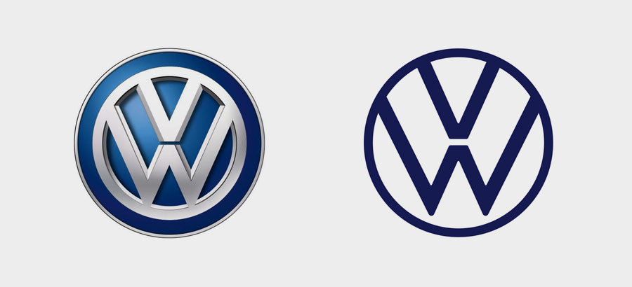
A rebranding project is all about changing those elements. But because brand identity is the element that we get confronted with the most, we often think that it’s the only aspect being changed. We see Volkswagen’s new logo and think: “Nice one VW!”. We don’t see what’s happening backstage, which is the German automaker’spivot to the EV market, meaning a change in positioning, values, and signaling strategy.
Brand identities are merely vehicles for the business needs of the brand. But because every message needs to be communicated with the appropriate image, they often change with every new milestone and thereby lies the challenge.
The challenge with rebranding
Think about it. Every time you change your visual identity, such as replacing your company’s logo, the new design must replace all of the originals. Now it’s one thing to swap the logo on your website and social media, but what about the non-digital assets?
Logistic challenge
Imagine what Accenture would have to go through to rebrand. All those signs, banners, and stationery items would not only have to be reconstructed, rebuilt, or reprinted, they would also need to be redesigned. Imagine redesigning half a million business cards! Now, had they been using ascalable business card printing solution like the one from yours truly, they would only have to upload the new design once and bippity boppity boo: half a million packs of business cards arrive in the mail! Neat, right?
But there isn’t a magical solution for everything. And that’s part of the reason why a rebranding costs so much. We could go into the details of what a logistical nightmare it can be to maintain consistency over a global brand presence, but you get the gist.
Risk of losing brand recognition
This is why many brands are afraid of rebranding projects. Consumers get accustomed to the brand’s visual identity. If a brand is doing well, they risk losing that recognition after a rebrand. Remember, this is about more than just the logo. Think color schemes, company name, pricing, mission, and services.
It’s another reason why branding jobs get expensive. Companies like the ones we discussed before they changed their names. Therefore, they needed to announce the new name. From media publicity to implementation, that sure needs a sizeable marketing campaign.
But now that we’ve seen that, let’s cut to the chase? Why do companies jump through all these hoops and invest heavily in rebranding?
Why do companies “rebrand”?
There are many reasons why they do. Most of them have to do with scale and adaptation. As a brand stays in business for years and years, many challenges arise that prevent it from moving forward or even from staying afloat. Often, a rebrand is the answer to that situation. Here are a few of the major reasons:
Outgrowing the current brand identity system
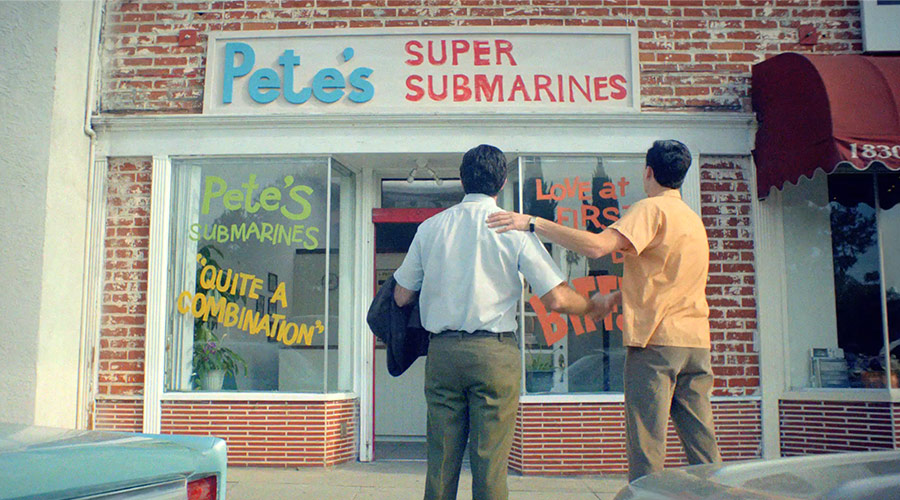
This is perhaps one of the most common reasons. Companies that do good, grow. For instance, when your friend Dr. Peter loans you 1000 dollars to open up a sandwich shop, you might be inclined to name your business after this great friend. Something like “Pete’s Super Submarines”, because you use baguettes and they look like tiny submarines. That’s cute. But when that business becomes the largest food franchise in the entire world with 44,758 locations worldwide, you might want to revisit that. You’d call it something like “Subway”, for instance. That’s the true story of what happened with Subway.
Apple Computers became Apple when they started to branch out into other electronics and consumer goods. Goodfellow’s Dry Goods Company rebranded to Target, and many more companies did the same.
But it’s not just hastily-made names that need a makeover. Sometimes, your brand identity is just right, but your logo falls short in some scenarios that you didn’t consider when your local town designer made it. That’s what happened to Slack.
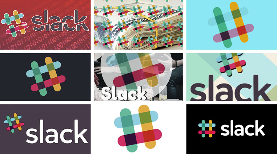
The logo that we all knew and loved failed as a complete brand identity system. It had too many colors, couldn’t be used with shadows, usage rules were too strict, the embroidery was a task from hell, and extrapolating it enough to form a homogenous identity was just impossible. That’s why they hired Pentagram, the world’s leading branding agency, to design something that works with the new scale.
Repositioning
Sometimes, your company or organization needs to branch out and do new things, sometimes technology changes and forces you to adopt new products, services, and markets. That often comes with scale too. But not necessarily. This is exactly what happened to Dunkin Donuts.
Dunkin Donuts was well known as a coffee/donut company. But as it grew to over 12,000 locations worldwide, they needed to brand out into other sources of revenue, which they did. The issue was that the name was now misleading.
You also have to consider the healthy-eating craze that’s been going on in the last few years. Having a fried pastry with calorie-loaded toppings in your company name just wasn’t a good idea anymore.
That’s why the chain began rebranding as a “beverage-led company” and was renamed Dunkin’ inJanuary 2019. They repositioned themselves in the marketplace and gave the company a brand identity that goes with it.
Internationalization
When you want to branch out into new countries, you have to consider the cultures that you are selling to and adjust. The best example is the Big Mac hamburger. In India, where consuming beef is illegal in most states, the Big Mac is called the Maharaja Mac and it’s made with mutton. But here’s a better example of how internationalization changes the brand itself, not just the product.
“Site Du Zero” (French for “Website of the Zero”) is a website where you learn everything about programming and IT related subjects. It had a very humorous approach where they called newbies “zeros”. Their mascot was even a donkey called ZorZor!

The website was so successful in France and French-speaking countries. Naturally, they wanted to go international but their brand couldn’t handle it. Calling your tight-knit community of early adopters who got free books zeros is one thing, but when you start handing out actual college degrees as they do now, you need to change your tone, and they did.
The website now has an English name optimized for the international market. It’s called openclassrooms.com. The primary language is English, not french. There is no mention of ZorZor and they don’t call anyone who pays 500$/month a zero. It just wouldn’t work on an international level. Not only did they change their name, logo, colors, language, tone, editorial, they even changed their company values and mission.
Crisis management
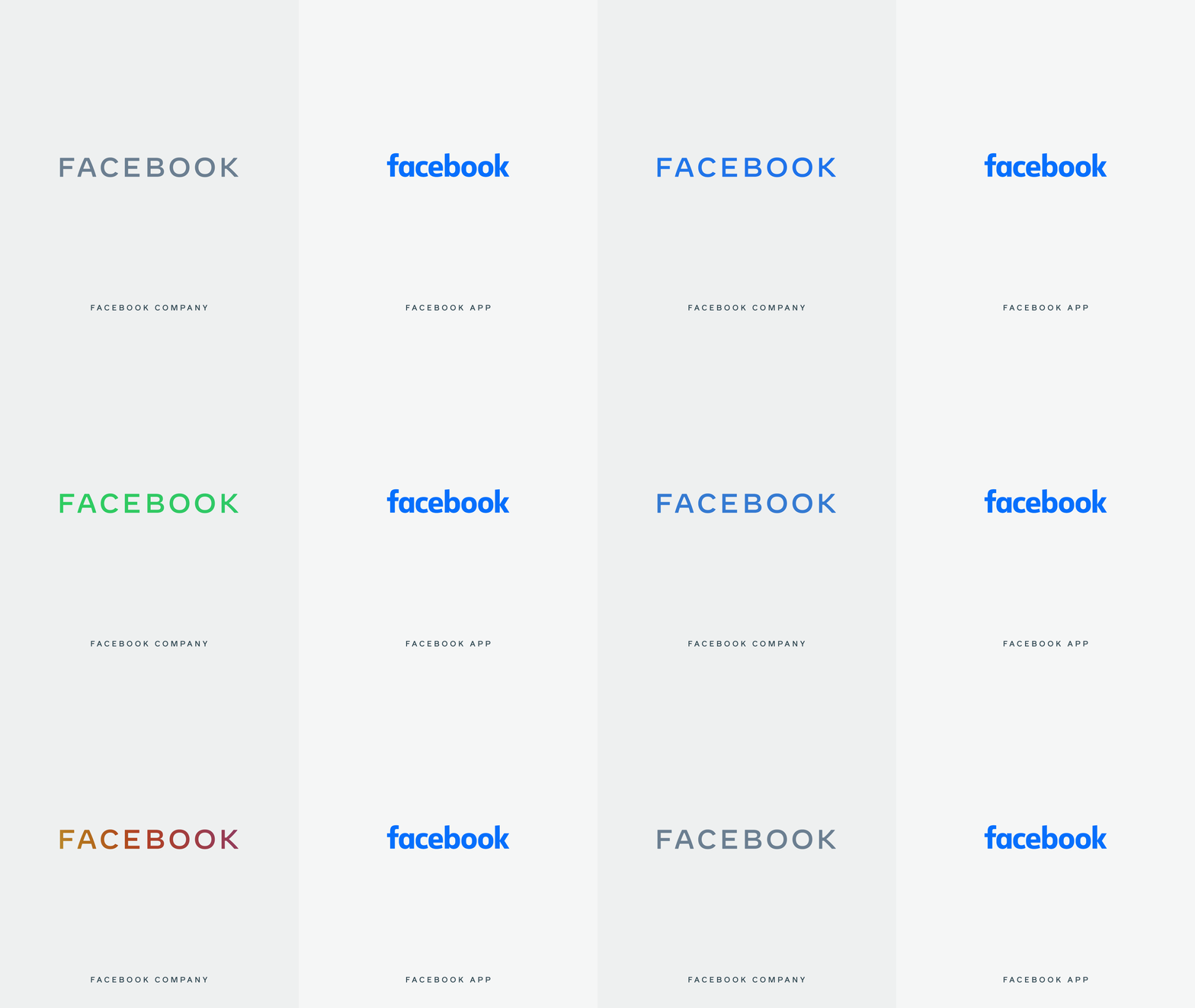
Many companies find themselves compelled to undergo rebrandings in order to live past PR crises. Perhaps the best example of this would be the latest Facebook rebranding. The company has been facing a lot of scrutiny in the past few years due to its privacy practices and their involvement in electoral manipulation and the spreading of misinformation.
Needing to distance themselves from this, the company had an ingenious plan. A rebrand. They decided to split the company and the service into two different brands. The company, now with the uppercase logo can take all the heat while the service, ever so loved by its user base can function quietly in the background.
The way this would work is that next time Zuck goes on a congressional hearing for a new data breach, news sites and channels will show the new logo, the company’s logo not the website’s logo, thus keeping their service relatively safer from association with poor privacy and conflict in general.
Keeping up with the times
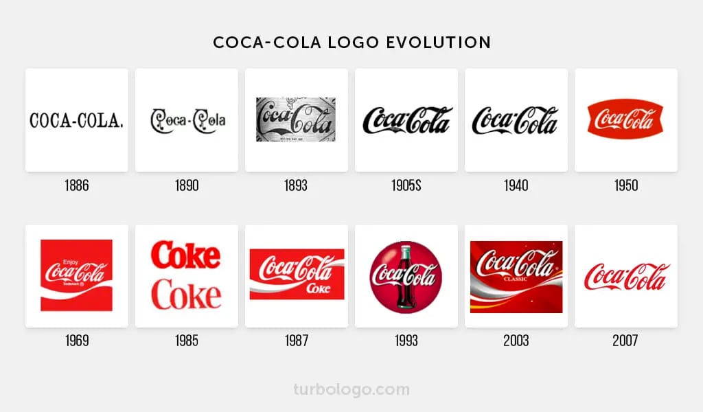
Companies also rebrand to keep up with the times. CocaCola has never changed any of its core brand pillars. They make a sweet refreshing drink that makes people feel good. Yet, they updated their brand identity system 12 times in the 121 years they’ve been in business. It’s always a new version of the same thing since 1905.
Other brands update their visual identity even more often. Being a leading internet company, Google always needs to be on the bleeding edge of technology as well as design. They used 3D letters when that was cool, shadows when that was possible, better colors when screens could handle them, and a minimal logo to go with their mission of organizing the world’s information.
The ROI of rebranding
Rebranding should be a response to a problem
The reasons that we’ve just seen are why we say that if you’re researching the ROI of a rebranding, you probably don’t need it. If you had a problem, you’d know what the ROI is. It’s getting that problem solved. How valuable that can be is a completely different question.
Well, then…how do we measure this ROI?
Rebranding is a tool. It’s not an outcome. How would you measure any other tool’s performance? You measure the outcomes, not the tool. Also, the better you can measure the problem, the better you can measure the outcome of the solution.
How do you measure the ROI of your PR strategy or your marketing campaign? If the goal was to get more leads, you compare how many leads you used to get with how many you’re getting after. What you did in between is largely irrelevant to what you measure. The same thing goes with a rebranding. With that in mind, the picture gets a lot clearer.
The metrics
We would even argue that the outcomes of a rebranding project are usually very quantifiable and thus measurable. Depending on the goal of the project, it is usually a combination of brand perception, recognition, awareness, loyalty, conversion etc… Those are all measurable.
For instance, it’s very simple to measure brand loyalty. It’s tied to repeat customer percentages, customer lifetime value, and referral rates. Conversion is a very straightforward metric as well and is tracked by every marketer. Also, there are many ways to measure brand awareness like surveys and focus groups or simply by search volume data. If more people search you on Google after a rebranding job, this means you’re more memorable and more present on their “top of mind”. When you know why you’re doing what you’re doing, it’s much easier to know if you’re doing it right.
Conclusion
The thing to keep in mind is that a rebrand is a response to an issue. What might seem to us as just an aesthetic direction can hide many business purposes. So the next time you see a company’s new branding or consider one for your business, try to think of why to do it and to what goal. And when it’s time to order fresh sets of business cards that align with your company’s new brand, use Brandly’s convenient business card ordering portal for the best results.
Set Up Your Free Business Card Portal
Get Started
