Love Minimal Design? Check Out These 10 Business Cards
You’ve probably heard the theory “less is more”, but you may not know that it’s one of the popular principles of good design. While many theories exist about what makes a design good or bad, these principles help differentiate what’s trendy from what’s timeless.
Following those principles, our current top 10 business card picks showcase a clean and simple aesthetic that keeps the focus on what is essential. Strong typography, use of negative space, and color all come together in minimal and modern business card designs that highlight the important information while also enhancing the brand identity.
1

Designed by Elegante Press for Augustas Didžgalvis
Minimal letterpress text complements the subtle type and luxurious paper stock in this business card design.
2

Designed by FRVR. Jan Vranovský for Vrrb Interactive
This business card design makes use of bright colors to enhance the energetic style of the brand while emphasizing the logo and contact information in white.
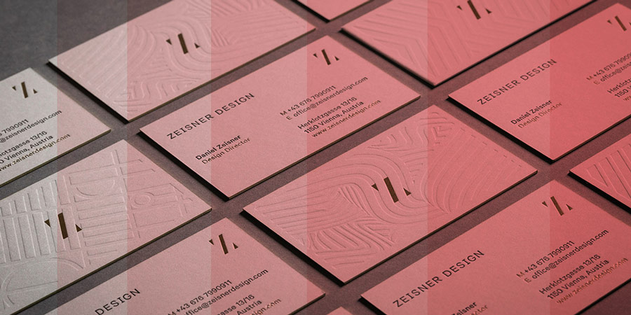
3

Designed by Matthias Kronfuss studio for Zeisner Design
This business card showcases both sophisticated design and attention to detail with an elegant gold foil finish that enhances the brand aesthetic.
4

The modern font and uncomplicated design truly embraces the “less is more” theory. The important contact information is easy to read and the logo is clean and simple.
5

Designed by Jon Orta for Taura (@interbrand)
A white on black color scheme highlights the double apostrophe as bullhorns, the trademark for a brand that promotes professional bullfighting. The brand identity is simple and unique.
6

Designed by toko.nu
Monochromatic colors and use of negative space keep the design minimal for these business cards.
7

Designed by Hey Studio for Astor Giles
Bold, geometric shapes represent the initials “AG” in this colorful and creative brand identity.
8

Designed by RISD Guild for member use
A neutral design allows for a striking logo with sharp angles and red type.
9

Designed by Misayo Sato for Maluma
The brightly colored text helps us visualize the shape of a circle in the negative space, the shape that represents the brand name.
10

Designed by Two of Us for personal branding
The blue and orange colors complement each other while the logo unites the design as it extends beyond the edge from one side to the other.
The Takeaway
Though not everyone will always agree with what makes a design good or bad, we believe our top 10 clean business card design picks are aesthetically pleasing, innovative, simple, and creative. We hope to inspire thought and invite conversation about what makes a good business card design.
And lastly, if you design business cards, consider checking partnering up with us and start offering to your clients the best business card ordering solution, for free.
Set Up Your Free Business Card Portal
Get Started