Serif vs. Sans Serif Fonts: What's the Difference and When to Use Each
What a serif font is, what sans serif means, how they differ in look, history and readability, which common fonts are which, and when to use each on business cards, documents and screens.
 By Brandly Team
Inspiration
On this page
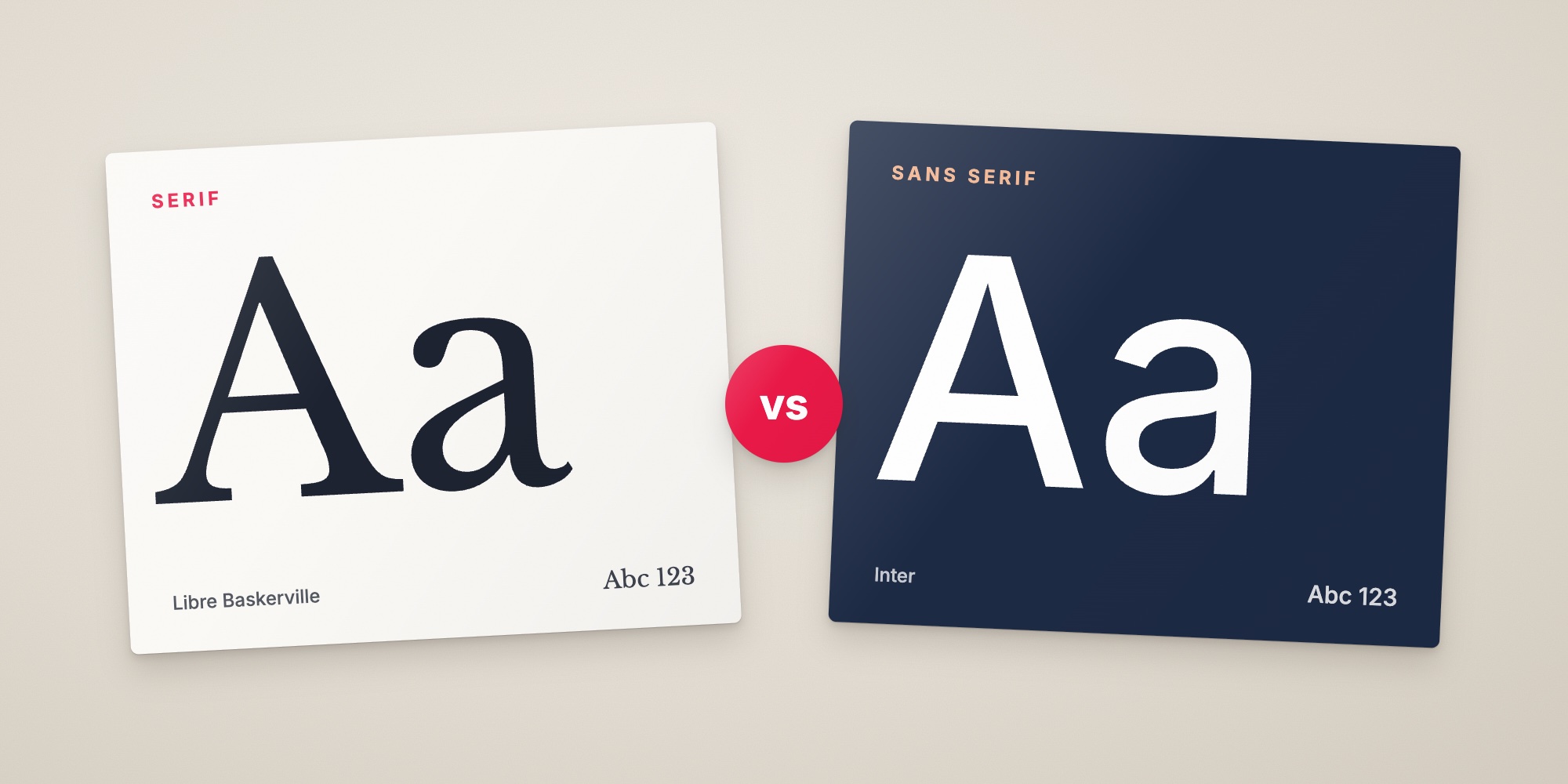
Serif fonts have small strokes, called serifs, at the ends of their letters, like Times New Roman and Garamond. Sans serif fonts don’t, like Arial and Helvetica. “Sans” is French for “without.” Serifs feel traditional and established. Sans serifs feel modern and clean. For most readers, neither is easier to read. Size, spacing and x-height matter more. Choose based on your brand’s personality, and test how the font holds up at the smallest size you’ll print.
Serif or sans serif is the first decision in choosing a font, and the one that shapes the personality of everything you print and publish. Here’s how to tell them apart, where each came from, what research says about readability, and how to choose.
What is a serif font?
A serif is the small stroke at the end of a letter’s main strokes. Look at the top and bottom of a capital “I” in Times New Roman, and you’ll see them. A serif font is any font with these strokes.
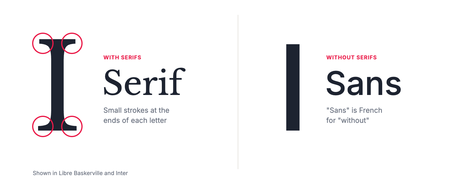
Serifs date back to letters carved in stone in ancient Rome, and they carried through to the first printed books. For centuries, most printing used serif fonts. Most books and many newspapers still do.
Examples: Times New Roman, Garamond, Georgia, Baskerville, Cambria. Free on Google Fonts: EB Garamond, Libre Baskerville, Lora, Merriweather, Source Serif 4.
What is a sans serif font?
A sans serif font has no serifs. “Sans” is French for “without.” The letters end in clean, plain strokes, and they usually have less contrast between thick and thin parts.
Sans serifs appeared in the early 1800s, mostly for posters and signs. They became mainstream in the 1900s with fonts like Futura in 1927 and Helvetica in 1957, and they took over screens because their simple shapes held up on early, low-resolution displays.
Examples: Arial, Helvetica, Calibri, Aptos, Verdana, Futura. Free on Google Fonts: Inter, Roboto, Open Sans, Lato, Source Sans 3.
Serif vs. sans serif at a glance
| Serif | Sans serif | |
|---|---|---|
| Look | Small strokes at the ends of letters, often thick and thin strokes | Plain stroke ends, usually even strokes |
| Feels | Traditional, established, literary | Modern, clean, neutral |
| History | Roman inscriptions, then centuries of printed books | Early 1800s posters, mainstream since the 1900s |
| Common uses | Books, newspapers, reports, law and finance brands | Screens, apps, signs, tech and most new brands |
| At small sizes | Fine if sturdy. Thin serifs can break up | Usually very clear |
| In foil or reversed out | Avoid thin serifs and hairlines | Usually reliable |
| Examples | Times New Roman, Garamond, Georgia | Arial, Helvetica, Calibri |
Is it serif or sans serif?
| Font | Type | Where you’ve seen it |
|---|---|---|
| Times New Roman | Serif | The old Word default. Created for The Times of London in 1932 |
| Georgia | Serif | Designed for screens, common on websites and in email |
| Garamond | Serif | Books, especially in older editions |
| Cambria | Serif | Word’s default heading font in Office 2007 and 2010 |
| Baskerville | Serif | Books, invitations, law firm letterhead |
| Courier | Serif (slab, monospace) | Typewriters, screenplays, code |
| Rockwell | Slab serif | Posters, signs, construction brands |
| Arial | Sans serif | Everywhere. A default on Windows and in Google Docs |
| Helvetica | Sans serif | Signs, logos and corporate brands |
| Calibri | Sans serif | Microsoft Office’s default from 2007 |
| Aptos | Sans serif | Microsoft’s newer Office default, announced in 2023 |
| Verdana | Sans serif | Designed for screens, very readable at small sizes |
| Futura | Sans serif | Fashion, film titles, design brands |
| Comic Sans | Sans serif | Informal signs. Not for business documents |
For the other font types, like slab serif, script and display, see types of fonts.
Which is easier to read?
You may have heard that serifs are easier to read in print because they guide the eye along the line, and sans serifs are easier on screens. Both rules are popular, but research doesn’t back them up for typical readers. Studies comparing the two have mostly found small or no differences in reading speed and comprehension.
What does make text easier to read:
- Size. Bigger is easier, up to a point. On a business card, keep contact details at about 8 pt and never below 7 pt.
- x-height. Fonts with taller lowercase letters look bigger and stay clear at small sizes.
- Open shapes. Letters like “a,” “e” and “c” should have clear openings, and similar letters like “I,” “l” and “1” should be easy to tell apart.
- Spacing. Comfortable spacing between letters and lines. See kerning, tracking and leading.
- Contrast. Dark text on a light background. Thin fonts on dark or patterned backgrounds are the hardest to read.
- Familiarity. People read fastest in styles they see every day.
For readers with dyslexia, there’s a little more evidence. A 2013 study by Luz Rello and Ricardo Baeza-Yates found that sans serif and non-italic fonts helped people with dyslexia read, while italic fonts made reading harder. If accessibility matters for a document, a clean sans serif without italics is a safe choice.
When to use serif or sans serif
Choose a serif when you want to look established, traditional or literary. Serifs suit law firms, financial advisers, universities, publishers, hotels and restaurants. They’re also a good choice for long printed reports.
Choose a sans serif when you want to look modern, clean and approachable. Sans serifs suit tech, healthcare, engineering, retail, nonprofits and most new brands. They’re the safer choice for small text, signs, screens and anything printed in foil or white on a dark background.
Use both when you want a little of each. A serif for headings and names with a sans serif for details and body text is one of the most reliable pairings. See how to pair fonts.
On business cards
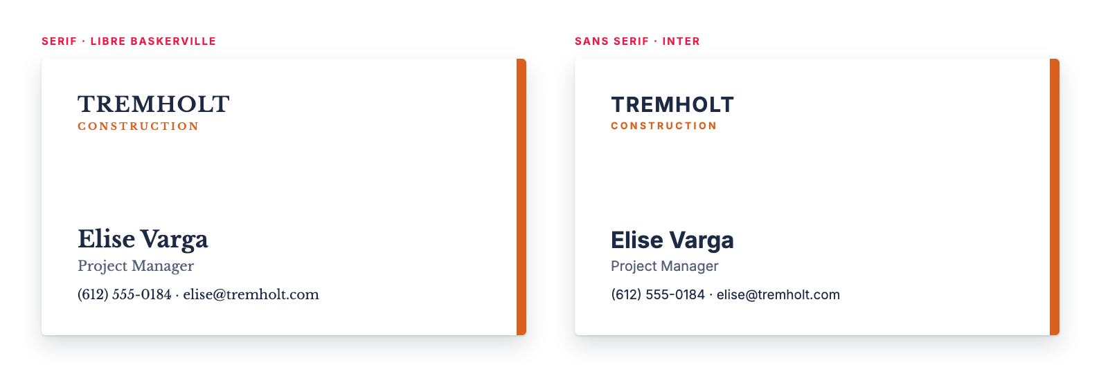
The serif version of the card feels established and a little formal. The sans serif version feels modern and practical. Both are readable, because both fonts are sturdy and have a generous x-height. Either would work for Tremholt, a made-up builder, so the choice comes down to how the company wants to come across.
A few rules for either choice:
- Test the smallest text at actual size. Print a sample before ordering.
- Avoid thin serifs and hairlines in small text, foil and white text on dark backgrounds.
- Use one font in two or three weights, or one serif and one sans serif, not more.
- Keep it the same for everyone. With Brandly, your card design becomes a locked template, so every employee’s card uses the same fonts and sizes. See fonts on business cards.
In documents and on letterhead
For long documents, either works. A serif like Georgia, Cambria or Source Serif gives reports a traditional feel. A sans serif like Aptos, Calibri, Arial or Source Sans looks modern and stays clear at small sizes. Match your letterhead, envelopes and other printed items to your business cards. See letterhead, envelopes and badges.
On screens and in email
Today’s high-resolution screens show serifs and sans serifs equally well, so use your brand fonts on your website. Email signatures are the exception. Custom fonts usually get swapped for a default, so use standard fonts like Arial, Helvetica, Georgia or Verdana. See email signature design guidelines.
- Serif: traditional and established. Good for names, headings and long printed text.
- Sans serif: modern and clean. Good for small text, screens, signs and foil.
- Readability depends more on size, x-height, spacing and contrast than on serifs.
- Pair them with a serif for headings and a sans serif for details, or the other way around.
- Test at actual size, especially contact details at 8 pt.
- Use the same fonts on business cards, letterhead and email signatures.
Serif vs. sans serif FAQs
What is a serif font?
A font with serifs, the small strokes at the ends of letters. Times New Roman, Garamond, Georgia and Baskerville are serif fonts. They tend to look traditional and established.
What does sans serif mean?
“Sans” is French for “without,” so a sans serif font has no serifs. Arial, Helvetica, Calibri and Verdana are sans serif fonts. They tend to look modern and clean.
Which is easier to read, serif or sans serif?
Neither, in most tests. Studies of reading speed and comprehension haven’t found a reliable winner for typical readers. Size, x-height, spacing and contrast matter more than serifs. One study of readers with dyslexia found that sans serif fonts helped and italics hurt.
Is Arial a serif or sans serif font?
Arial is a sans serif font. Times New Roman, Georgia, Cambria and Garamond are serif fonts. Calibri, Aptos, Helvetica and Verdana are sans serif.
Which is more professional, serif or sans serif?
Both look professional when they’re well chosen and used consistently. Serifs feel traditional, which suits law, finance and publishing. Sans serifs feel modern, which suits tech, healthcare and most new brands.
Can you use serif and sans serif fonts together?
Yes. A serif for headings or names with a sans serif for body text, or the other way around, is one of the most common and reliable font pairings.
The takeaway
Serif fonts have small strokes at the ends of their letters and feel traditional. Sans serif fonts don’t, and feel modern. For most readers, neither is easier to read, so choose the one that fits your brand, then check that it holds up at the sizes you’ll actually use. For specific font recommendations, see professional fonts for business.
Set Up Your Free Business Card Portal
Get Started