Professional Fonts: 16 Free Fonts for Business, Plus the Paid Classics
The best professional fonts for business: 16 free Google Fonts, the paid classics, safe fonts for documents, professional font pairings, fonts by industry, and fonts to avoid.
 By Brandly Team
Inspiration
On this page
The most professional fonts are clean, readable and come in several weights. Free picks: Inter, Source Sans 3, Lato, Open Sans, Roboto and IBM Plex Sans (sans serif), and Source Serif 4, Libre Baskerville, Lora, Merriweather and EB Garamond (serif). All are free on Google Fonts, including for print. Paid classics: Helvetica, Avenir, Futura, Garamond and Baskerville. Use one or two typefaces and keep them the same on every business card, document and email.
A professional font isn’t a fancy one. It’s a font that’s easy to read, looks the same everywhere you use it, and fits the way your company wants to come across. Here are 16 free fonts that do the job, the paid classics, safe choices for shared documents, and pairings that work.
What makes a font look professional?
- It’s easy to read, including at small sizes. Look for open letter shapes and a generous x-height. See parts of a letter.
- It has several weights, at least regular and bold, and ideally italics. One family can then handle names, titles, headings and body text.
- It’s neutral enough to last. Trendy fonts date quickly. Clean serifs and sans serifs still look right years later.
- It’s licensed for how you use it, including print, your website and apps.
- You use it consistently. The same fonts on every business card, document, sign and email look more professional than any single font choice.
Most professional fonts are serifs or sans serifs. For the difference, see serif vs. sans serif.
16 free professional fonts
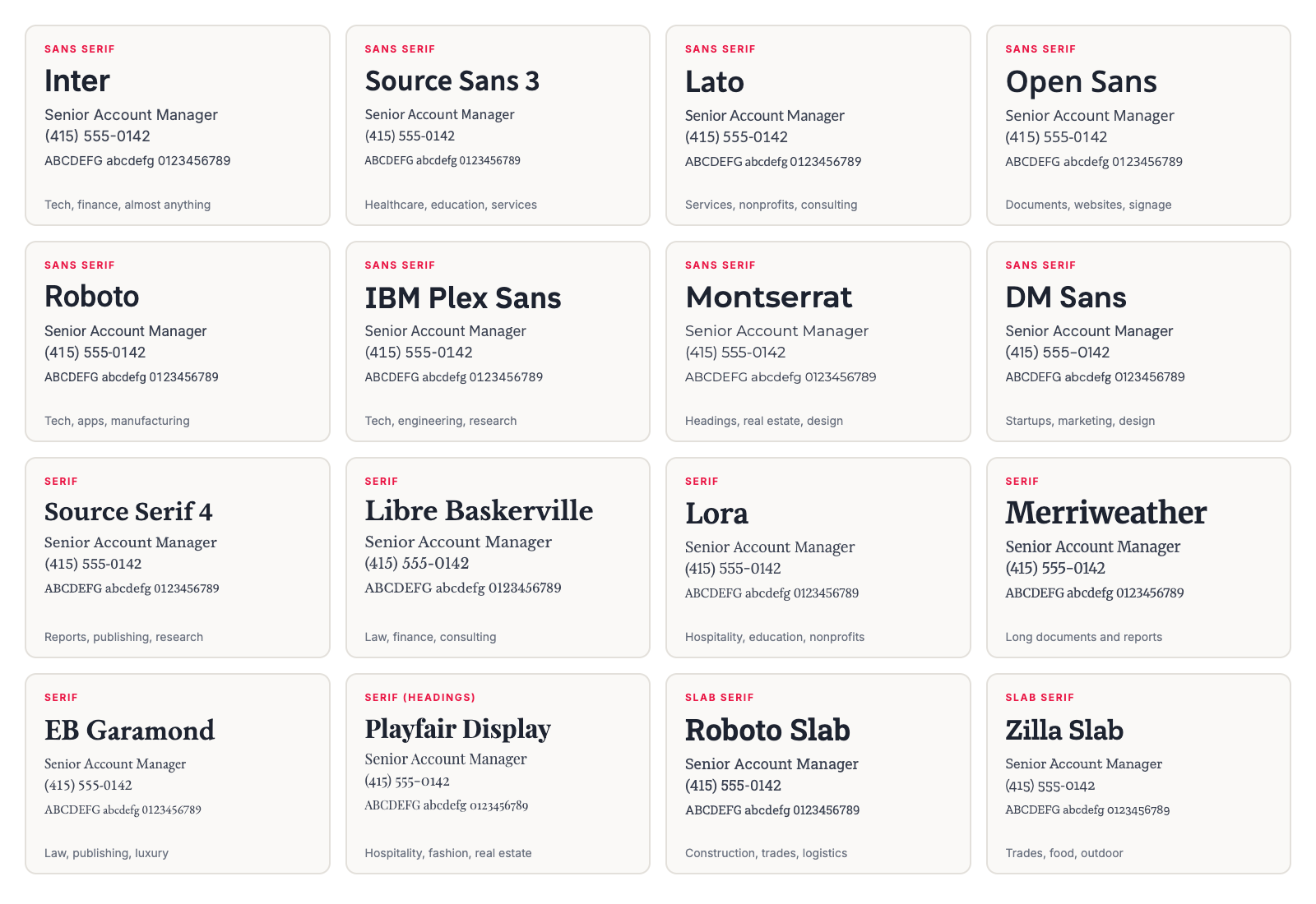
Every font below is free on Google Fonts, and free for commercial use, including printed business cards and letterhead.
Sans serif
| Font | Why it works | Best for |
|---|---|---|
| Inter | Designed for screens, neutral and very clear at small sizes, with many weights | Tech, finance, almost anything |
| Source Sans 3 | Adobe’s open-source sans serif. Friendly, humanist shapes | Healthcare, education, services |
| Lato | Warm and balanced. Its name is Polish for “summer” | Services, nonprofits, consulting |
| Open Sans | Open, readable letters. Designed by Steve Matteson, who also designed Microsoft’s Aptos | Documents, websites, signage |
| Roboto | Google’s font for Android. Mechanical but friendly | Tech, apps, manufacturing |
| IBM Plex Sans | IBM’s own corporate typeface, released free in 2017 | Tech, engineering, research |
| Montserrat | Wide, geometric letters inspired by old signs in Buenos Aires | Headings, real estate, design |
| DM Sans | Clean, low-contrast geometric sans serif | Startups, marketing, design |
Serif
| Font | Why it works | Best for |
|---|---|---|
| Source Serif 4 | Adobe’s serif companion to Source Sans. Sturdy and readable | Reports, publishing, research |
| Libre Baskerville | A Baskerville built for body text on screens, with a large x-height | Law, finance, consulting |
| Lora | Calligraphic curves, warm and literary | Hospitality, education, nonprofits |
| Merriweather | Sturdy and slightly condensed, made to be read on screens | Long documents and reports |
| EB Garamond | A free revival of the classic Garamond | Law, publishing, luxury |
| Playfair Display | High contrast and elegant. For headings and names only | Hospitality, fashion, real estate |
Slab serif
| Font | Why it works | Best for |
|---|---|---|
| Roboto Slab | The slab serif companion to Roboto. Sturdy and clear | Construction, trades, logistics |
| Zilla Slab | Mozilla’s brand typeface. Friendly with a little character | Trades, food, outdoor |
Watch out for Playfair Display and other high-contrast fonts at small sizes. Their thin strokes can disappear at 8 pt, in foil, or in white on a dark background. Use them for names and headings, with a sturdier font for contact details.
The paid classics
These are some of the most widely used professional typefaces. They’re commercial fonts, so check that your license covers print and any web or app use.
| Font | Type | Known for |
|---|---|---|
| Helvetica | Sans serif | Neutral and everywhere since 1957. Signs, logos and corporate brands |
| Avenir | Sans serif | A warmer geometric sans serif by Adrian Frutiger, from 1988 |
| Futura | Sans serif | Geometric and stylish, from 1927. Fashion and design brands |
| Gill Sans | Sans serif | Classic British humanist sans serif from 1928 |
| Proxima Nova | Sans serif | A modern geometric favorite for websites and startups |
| Garamond | Serif | Elegant and literary, based on 1500s French type |
| Baskerville | Serif | Crisp and authoritative, from the 1750s. Law and finance |
| Caslon | Serif | Traditional English serif from the 1700s |
Free alternatives: Inter or Roboto for Helvetica, Jost for Futura, Source Sans 3 for Gill Sans, EB Garamond for Garamond, and Libre Baskerville for Baskerville. They’re not identical, but they have a similar feel.
Safe fonts for shared documents
If other people will open and edit a document, use a font they already have. Otherwise, their computer swaps in a default, and your layout shifts.
| Font | Type | Notes |
|---|---|---|
| Aptos | Sans serif | Microsoft’s newer Office default, announced in 2023 |
| Calibri | Sans serif | Office’s default from 2007. Still on almost every Windows computer |
| Arial | Sans serif | On almost every computer, and the Google Docs default |
| Verdana | Sans serif | Wide and very readable at small sizes |
| Georgia | Serif | Readable serif made for screens |
| Cambria | Serif | Sturdy serif that comes with Office |
| Times New Roman | Serif | Universal, but looks dated for most brands |
For documents you send as PDFs, embed your brand fonts and they’ll look right everywhere. For email signatures, stick to standard fonts like Arial, Helvetica, Georgia or Verdana. See email signature design guidelines.
Professional font pairings
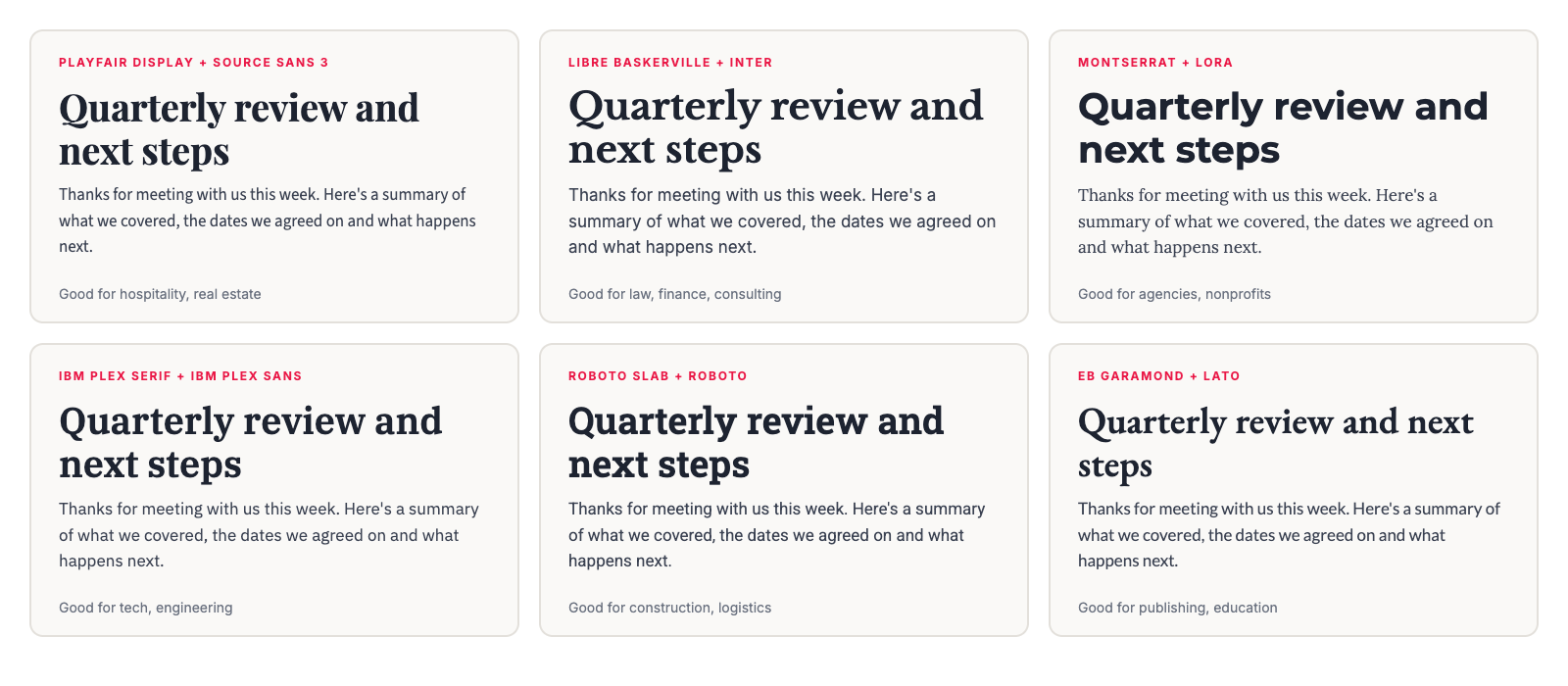
Pairing a serif with a sans serif is a reliable way to add character while staying readable. Use one for headings and names, and the other for body text and contact details.
| Headings or names | Body and details | Feel | Good for |
|---|---|---|---|
| Playfair Display | Source Sans 3 | Elegant, upscale | Hospitality, real estate |
| Libre Baskerville | Inter | Established, trustworthy | Law, finance, consulting |
| Montserrat | Lora | Modern with warmth | Agencies, nonprofits |
| IBM Plex Serif | IBM Plex Sans | Precise, technical | Tech, engineering |
| Roboto Slab | Roboto | Sturdy, practical | Construction, logistics |
| EB Garamond | Lato | Classic, approachable | Publishing, education |
Superfamilies like IBM Plex, Roboto and Source include matching serif and sans serif versions designed to work together, so they’re an easy way to pair fonts. For more pairing rules, see how to pair fonts.
Fonts by industry
| Industry | Usual choice | Free fonts to try |
|---|---|---|
| Law, finance, insurance | Classic serif, or a serif with a neutral sans | Libre Baskerville, EB Garamond, Source Serif 4 |
| Tech and software | Neutral or geometric sans serif | Inter, IBM Plex Sans, DM Sans |
| Healthcare | Friendly humanist sans serif | Source Sans 3, Lato, Open Sans |
| Construction and trades | Sturdy sans serif or slab serif | Roboto Slab, Zilla Slab, Roboto |
| Real estate | Elegant serif for names, clean sans for details | Playfair Display, Montserrat, Lato |
| Education and nonprofits | Warm serif or humanist sans | Lora, Merriweather, Source Sans 3 |
| Hospitality | Elegant serif, sometimes with a script accent | Playfair Display, Lora, EB Garamond |
| Creative and design | Geometric sans or a distinctive serif | Montserrat, DM Sans, Jost |
These are starting points, not rules. A law firm with a modern sans serif can stand out for the right reasons.
Fonts to avoid in business
- Comic Sans, Papyrus and novelty fonts. They’re fine for a bake sale flyer, not for a proposal.
- Script fonts for whole paragraphs or contact details. Save scripts for a name or a few words. See script fonts.
- Very thin weights at small sizes. Light and thin fonts break up at 8 pt and in foil.
- Too many fonts. More than two typefaces usually looks messy.
- Fonts without the weights you need. If a font has no bold, a fake bold from your software looks clumsy.
- Unlicensed fonts. A font downloaded from a free font site may not cover commercial use. Check the license, or use Google Fonts.
Using your fonts on business cards
Your business card is where your fonts get the hardest test: small sizes, lots of details, and sometimes foil or a dark background.
- Names: 10 to 12 pt, in your heading font or a bold weight.
- Titles and contact details: about 8 pt, in a sturdy serif or sans serif. Never below 7 pt. See business card font sizes.
- Embed your fonts in the PDF you send, so the text prints exactly as designed.
- Match your letterhead, envelopes and badges. See letterhead, envelopes and badges.
With Brandly, you upload your card design once, and it becomes a locked template. Your brand fonts, sizes and layout stay fixed, and each employee types in only their own details, so every card looks like it came from the same company. See how to prepare a business card PDF.
- Choose one or two typefaces with regular and bold weights.
- Pick a sturdy font for small text like contact details.
- Save high-contrast and script fonts for names and headings.
- Use standard fonts for shared documents and email signatures.
- Check your licenses cover print, web and apps, or use Google Fonts.
- Embed fonts in every PDF you send to a printer.
- Lock the fonts into your business card template.
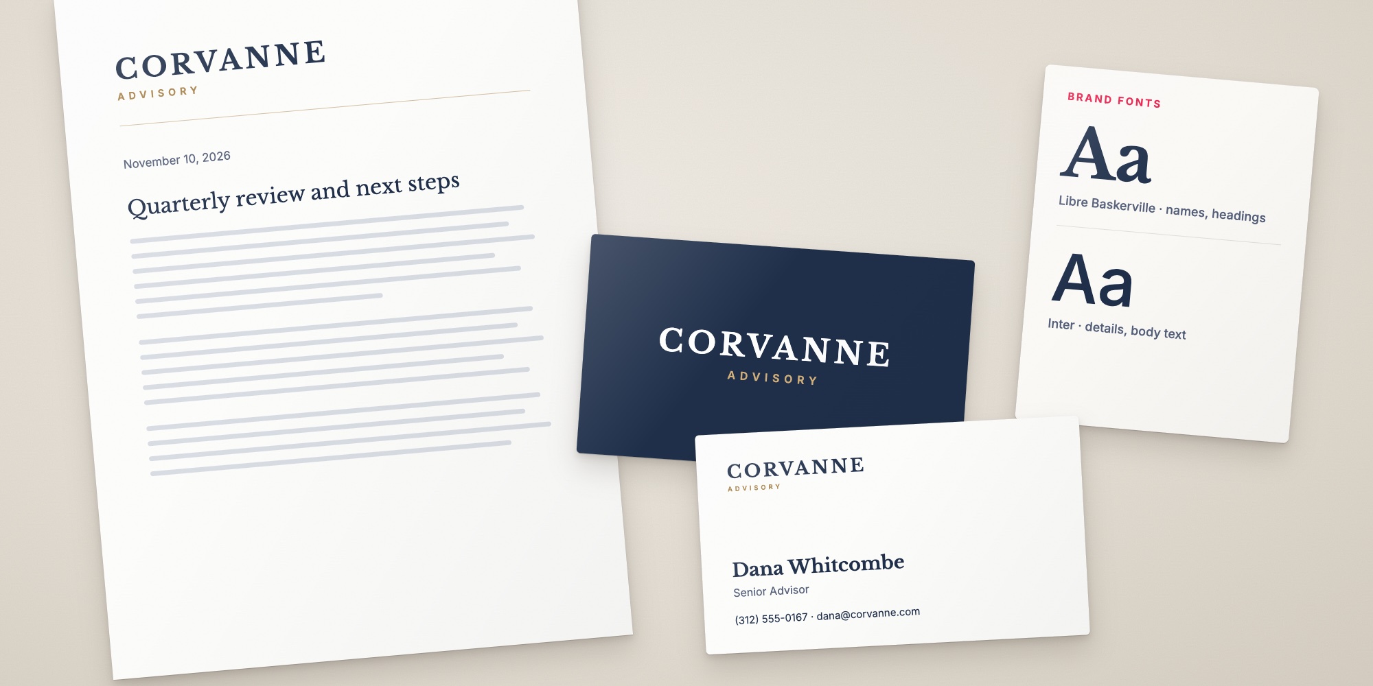
Corvanne Advisory, shown in the image above, is a made-up company.
Professional fonts FAQs
What is the most professional font?
There’s no single answer, but clean, readable fonts with several weights look the most professional. Helvetica, Inter and Source Sans are reliable sans serifs. Garamond, Baskerville and Source Serif are reliable serifs. Consistency matters as much as the font itself.
What are the best free professional fonts?
Inter, Source Sans 3, Lato, Open Sans, Roboto and IBM Plex Sans are excellent free sans serifs. Source Serif 4, Libre Baskerville, Lora, Merriweather and EB Garamond are excellent free serifs. All are on Google Fonts and free for commercial use, including print.
What font should I use for business documents?
If others will edit the document, use a font everyone has: Aptos, Calibri, Arial, Georgia or Cambria. For documents you send as PDFs, use your brand fonts. For body text, 10 to 12 pt is typical.
How many fonts should a business use?
One or two typefaces. Many strong brands use one typeface in several weights. A common setup is a serif for headings with a sans serif for body text, or the other way around.
Which fonts look unprofessional?
Comic Sans, Papyrus and novelty fonts, scripts used for whole paragraphs, very thin weights at small sizes, and mixing too many fonts. Default fonts aren’t unprofessional, but they won’t help your brand stand out.
Are Google Fonts OK to use on business cards?
Yes. Google Fonts are free for commercial use, including printed business cards, letterhead and signs. Embed the fonts in the PDF you send your printer.
The takeaway
The most professional fonts are readable, come in several weights and get used the same way everywhere. Start with a free font like Inter, Source Sans 3, Libre Baskerville or Source Serif 4, pair it with one other font if you need to, and lock it into your business cards, documents and email signature. For background on font categories, see types of fonts.
Set Up Your Free Business Card Portal
Get Started