Famous Logos: 25 Iconic Brand Marks and What They Teach About Your Logo
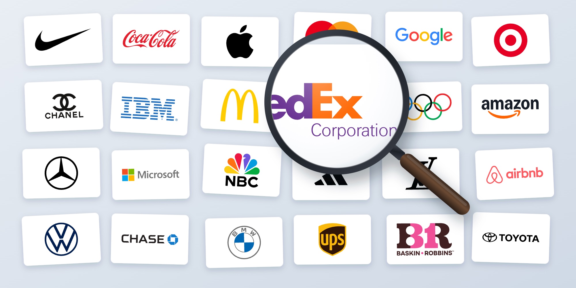
25 famous logos, from the Nike Swoosh and Apple's apple to the FedEx arrow, with the story behind each one and what it teaches about using your own logo on business cards and print.
 By Brandly Team
Inspiration
On this page
The world’s most famous logos, such as the Nike Swoosh, Apple’s apple, McDonald’s Golden Arches and the Coca-Cola script, share four traits: they’re simple enough to draw from memory, they work in one color, they stay clear at small sizes, and they’ve been used the same way for years. Below are 25 famous logos, the story behind each one, and what each teaches about putting your own logo on business cards, letterhead and badges.
Most people can sketch a dozen logos from memory. That isn’t an accident. The logos below were designed to be simple, then used the same way on everything for decades, until the shape alone was enough.
You don’t need a billion-dollar ad budget to learn from them. The same rules decide whether your own logo looks sharp on a business card, survives gold foil, and is still recognizable in the corner of a name badge.
Logos shown are trademarks of their respective owners and are included for commentary. Brandly isn’t affiliated with or endorsed by these companies.
What famous logos have in common
| Trait | Famous example | What it means for your logo |
|---|---|---|
| Simple | Nike Swoosh | One shape someone could sketch on a napkin |
| Works in one color | Apple | Looks right in black, white or a single brand color |
| Clear when small | Target | Recognizable at a quarter inch, the size of a badge logo |
| Ownable | Mastercard’s circles | A shape nobody else in your industry uses |
| Consistent | Coca-Cola | The same file, colors and spacing on everything, for years |
Symbols
A symbol, or pictorial mark, is a shape that stands for the company without words. It’s the hardest kind of logo to build, because people only recognize it after years of seeing it next to the name.
1. Nike

Carolyn Davidson designed the Swoosh in 1971, while she was a graphic design student at Portland State University. Nike paid her $35. In 1983 the company gave her a gold Swoosh ring and Nike shares as a thank-you. Since about 1995, Nike has used the Swoosh on its own, with no name next to it.
Lesson: a simple shape can become the brand. But Nike had the name beside it for more than 20 years first. Keep your name next to your symbol.
2. Apple

Apple’s first logo, from 1976, was a detailed drawing of Isaac Newton under a tree. A year later, Rob Janoff replaced it with the rainbow-striped apple. The bite was “for scale,” Janoff has said, so people would read it as an apple and not a cherry. Apple switched to a single-color apple in 1998.
Lesson: Apple’s first logo was too detailed to work small, and the stripes were hard to print. The plain apple works on anything.
3. Target

Target’s bullseye debuted in 1962 as three rings next to the name. In 1968 it was simplified to the single ring and dot people know today.
Lesson: the logo matches the name. If your logo can be a picture of your name, people remember both.
4. Mercedes-Benz

Daimler registered the three-pointed star as a trademark in 1909. The company says the points stand for engines on land, on water and in the air.
Lesson: a symbol with a story is easier to remember. Make sure you can explain yours in one sentence.
5. Mastercard

The overlapping red and yellow circles arrived in 1968, when the card was still called Master Charge. Pentagram simplified them in 2016. In 2019, Mastercard dropped its name from the symbol, so the circles stand alone.
Lesson: two circles are about as simple as a logo gets, and they still belong to one company, because the colors and overlap are used the same way every time.
6. Chase


Tom Geismar of Chermayeff & Geismar designed the Chase octagon for Chase Manhattan Bank. It was introduced in 1960 and rolled out in 1961. It’s four wedge shapes rotated around a square, and the bank still uses it today.
Lesson: an abstract shape doesn’t have to show what you do. It has to be distinctive, and used consistently.
7. The Olympic rings

Pierre de Coubertin designed the five rings in 1913. He said the five colors and the white background included at least one color from every national flag at the time.
Lesson: a logo can carry a big idea in very simple shapes.
8. Microsoft

In August 2012, Microsoft replaced the italic wordmark it had used since 1987 with four colored squares next to the name, set in its own Segoe typeface. The logo was designed in-house, and Microsoft said the four colors stand for its range of products.
Lesson: four squares are easy to draw, print and recognize at any size, even as a tiny app icon or in the corner of a badge.
9. Adidas

Adidas has used three stripes on its shoes since the company was founded in 1949. The story goes that Adi Dassler bought the three-stripe mark from the Finnish brand Karhu in 1952 for a small sum and two bottles of whiskey. The trefoil logo followed in 1971. The three bars first appeared in 1991 on the Equipment line and became the main logo in 1997.
Lesson: a simple graphic device used everywhere can be as recognizable as the logo itself. A brand color bar or a pattern you repeat on every card works the same way.
10. Airbnb

In July 2014, Airbnb introduced the “Bélo,” designed by the London agency DesignStudio as a symbol of belonging. It combines a person, a location pin, a heart and the letter A, and it was designed so anyone could draw it. It was widely mocked at launch, and it’s still Airbnb’s logo today.
Lesson: criticism at launch is normal. A simple mark wins over time if you use it consistently.
11. NBC

NBC introduced its peacock in 1956 to promote color television broadcasts. The six-feather version used today was designed by Chermayeff & Geismar in 1986.
Lesson: the peacock got simpler as it aged, down to six bold feathers. Simplify your logo before you print it on everything.
Wordmarks
A wordmark is the company name set in a distinctive way. It’s the most practical logo for a small or new company, because people learn the name and the logo at the same time.
12. Coca-Cola

Frank Mason Robinson, John Pemberton’s partner and bookkeeper, suggested the name Coca-Cola and wrote it out in Spencerian script, the formal handwriting of the time, in 1886. The script has barely changed since.
Lesson: consistency beats novelty. Coca-Cola has run plenty of campaigns, but the script stays the same.
13. Google

Ruth Kedar designed Google’s 1999 logo, based on a serif typeface called Catull. In 2015, Google replaced it with a simple sans-serif it drew itself, which stays readable on small phone screens.
Lesson: if your wordmark has to work tiny, on a phone or a name badge, simple letters win.
14. FedEx
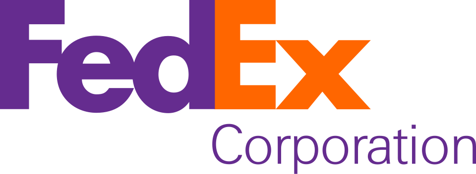

Lindon Leader at Landor Associates designed the FedEx logo in 1994. Look at the white space between the “E” and the “x”: it forms an arrow pointing forward.
Lesson: hidden details are a bonus. The logo works because the name is bold and readable, and the arrow is just a reward for those who spot it.
15. IBM

The designer Paul Rand created IBM’s logo in 1956, then added the stripes in 1972 to suggest speed. The striped version is still in use.
Lesson: stripes and fine lines can fill in when they’re printed small. IBM has used both 8-stripe and 13-stripe versions of its logo. If yours has fine lines, ask your designer for a version that holds up at small sizes.
16. Disney

The Disney wordmark is based on Walt Disney’s signature, but it’s a stylized version drawn by the studio’s artists, not his actual autograph.
Lesson: a signature-style logo feels personal, but it needs to be drawn as clean artwork, not scanned from a real signature.
17. Amazon

Turner Duckworth designed Amazon’s logo in 2000. The orange arrow under the name points from the “a” to the “z”, for everything from A to Z, and doubles as a smile.
Lesson: one small detail can carry the whole message, and it still works in one color.
Letter marks and monograms
Letter marks use initials or a single letter. They work well when a name is long, or when the brand wants a small mark for tight spaces like app icons and badges.
18. McDonald’s

The Golden Arches started as part of the restaurant buildings, designed by architect Stanley Meston in 1952 and first opened in 1953. In 1962, the company’s head of engineering and design, Jim Schindler, turned the arches into an “M.” The logo’s current form dates from 1968.
Lesson: your logo can come from something people already associate with you.
19. Chanel

The interlocking double C, usually dated to 1925, is one of fashion’s best-known monograms. It’s two letters, one color and perfectly symmetrical.
Lesson: monograms look great in foil and embossing, because they’re simple, solid shapes.
20. Louis Vuitton

Georges Vuitton created the LV monogram canvas in 1896, partly to stop copies of the company’s earlier checkered pattern.
Lesson: a logo that’s distinctive enough to protect is worth more than one that looks like everyone else’s.
21. Volkswagen

In 2019, Volkswagen replaced its shaded, three-dimensional logo with a flat one. It was designed for screens, and it also prints more cleanly.
Lesson: shadows, bevels and gradients date quickly, and they’re hard to print. Flat logos last.
Emblems
An emblem puts a symbol or the name inside a badge shape, like a circle or a shield. Emblems feel established, but any small text inside the badge is the first thing to blur when it’s printed small.
22. BMW

BMW’s blue-and-white roundel dates from 1917. A popular story says it shows a spinning propeller, but that idea comes from a 1929 BMW ad. The blue and white are Bavaria’s colors, in reverse order. In 2020, BMW introduced a flat version with a transparent ring for its communications.
Lesson: BMW has kept the same shape for more than 100 years and only updated the finish. Refresh the details, keep the shape people know.
23. UPS

In 1961, Paul Rand designed a UPS shield with a string-tied package on top. In 2003, as UPS grew beyond delivering packages, it dropped the package and moved to the brown-and-gold shield.
Lesson: a logo that shows exactly what you do today can date as your business grows. A simpler shape leaves room to change.
Logos with hidden meanings
Hidden details make a logo fun to discover, like the FedEx arrow and the Amazon smile. They only work when the logo is clear without them.
24. Toyota


Toyota’s emblem of three overlapping ovals debuted in October 1989 for the company’s 50th anniversary. Toyota says the two inner ovals form a “T” and stand for the hearts of the customer and the company, and the outer oval stands for the world. Some people also point out that every letter of TOYOTA can be traced inside the emblem, though Toyota doesn’t say that itself.
25. Baskin-Robbins
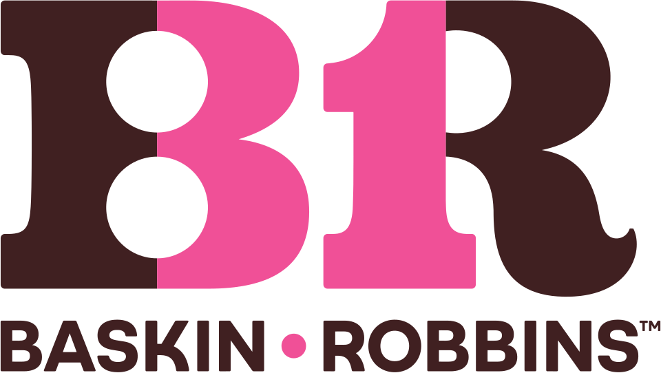

The pink parts of the “BR” in the Baskin-Robbins logo form the number 31, for the original 31 flavors. The hidden number arrived with a new logo in 2006.
Lesson for both: a hidden detail is a nice extra, not the main idea. People should recognize the logo before they notice the secret.
Test your logo like a famous brand
Famous logos work because they pass a few simple tests. Run your own logo through them before it goes on every card your team orders.
The small-size test
Print your logo at 1 inch, half an inch and a quarter inch. A quarter inch is about the size of a logo in a name badge corner or next to a social icon. If the details blur or the text disappears, you need a simpler version for small uses.
Too much detail
The laurel, banner and motto look fine at 1 inch. At a quarter inch, the size of a logo on a name badge or in a corner of a card, they turn to mush.
Simple enough to shrink
One bold shape stays clear at every size. Like the Nike Swoosh or the Apple apple, you can recognize it from across a room.
The one-color test
Print it in black only, then in white on your brand color. If it falls apart without its colors or gradients, ask your designer for one-color and reversed versions. You’ll need them for stamps, embroidery, dark cards and foil.
Full color
The everyday version: navy and orange on white.
One color
Black only, for stamps, forms, fax cover sheets and one-color jobs.
Reversed
White on the brand color, for dark cards, badges and signage.
Gold foil
One flat shape is easy to foil. Fine detail and gradients aren't.
The foil and spot gloss test
Foil and spot gloss work best on solid shapes and bold type. Fine lines, gradients and tiny text don’t foil cleanly. If you want a gold logo on a business card, a simple mark like Chanel’s or Mastercard’s is ideal. See business card paper types for which papers take foil.
The consistency test
Look at your current business cards, letterhead, badges and email signatures side by side. Are they all using the same logo file, colors and spacing? Famous brands are recognizable because they never vary. On a team, the easiest way to get there is a locked template. See using your brand on a business card.
Putting your logo on business cards
| Do | Avoid |
|---|---|
| Use vector artwork (AI, EPS, SVG or PDF) | Logos copied from a website or a screenshot |
| Set colors in CMYK, or match your brand’s Pantone | RGB colors that print darker or duller than on screen |
| Keep the logo inside the safe area with clear space around it | Logos touching the trim edge |
| Use a size where all the text in the logo is readable | Shrinking a detailed logo until it blurs |
| Use one approved version on every card | Each office using its own version |
With Brandly, you upload your business card design once as a PDF with the logo placed as vector art, and it becomes a locked template. Your logo, colors and layout stay fixed, and each employee fills in only their own name and contact details. See how to prepare a business card PDF, business card size and safe area and fonts for business cards.
- Ask your designer for vector files: full color, one color and reversed.
- Check the small version at a quarter inch.
- Set colors in CMYK or your brand’s Pantone, not RGB.
- Keep clear space around the logo, inside the safe area.
- Use simple, solid shapes if you want foil or spot gloss.
- Lock one version into your card template, so every card matches.
Famous logo FAQs
What is the most famous logo in the world?
There’s no official ranking, but Apple’s apple, the Nike Swoosh, McDonald’s Golden Arches and the Coca-Cola script are among the most widely recognized logos anywhere. All four are simple, used consistently for decades, and recognizable without the company name.
What makes a logo famous?
Mostly time and consistency. The best-known logos are simple enough to remember, work in one color and at small sizes, and have been used the same way for years, on everything a company prints and puts on screen.
What are the main types of logos?
Wordmarks (Coca-Cola, Google), letter marks or monograms (Chanel, Volkswagen), symbols (Apple, Nike), emblems (BMW, UPS), mascots like the Michelin Man, and combination marks that pair a symbol with the name. Many companies use more than one version.
How big should a logo be on a business card?
There’s no fixed rule, but most cards use a logo around half an inch to an inch tall. Keep it inside the safe area, leave clear space around it, and make sure any small text in the logo is still readable at that size.
What file format should my logo be for printing?
Vector artwork, such as AI, EPS, SVG or a PDF exported from a design app, so it stays sharp at any size. For Brandly, upload your business card design as a PDF with the logo placed as vector art and colors set in CMYK.
Can I put a famous brand's logo on my business card?
Not without permission. Famous logos are registered trademarks. Use your own logo, and only add a partner’s or certification logo if their brand guidelines allow it.
The takeaway
The world’s most famous logos aren’t complicated. They’re simple, they work in one color and at small sizes, and they’ve been used the same way for years. Your logo doesn’t need Nike’s budget to follow the same rules. Get clean vector files, test the small and one-color versions, and put the same version on every business card, letterhead and badge your team uses.
Set Up Your Free Business Card Portal
Get Started