Types of Fonts: The 6 Main Font Types, With Examples
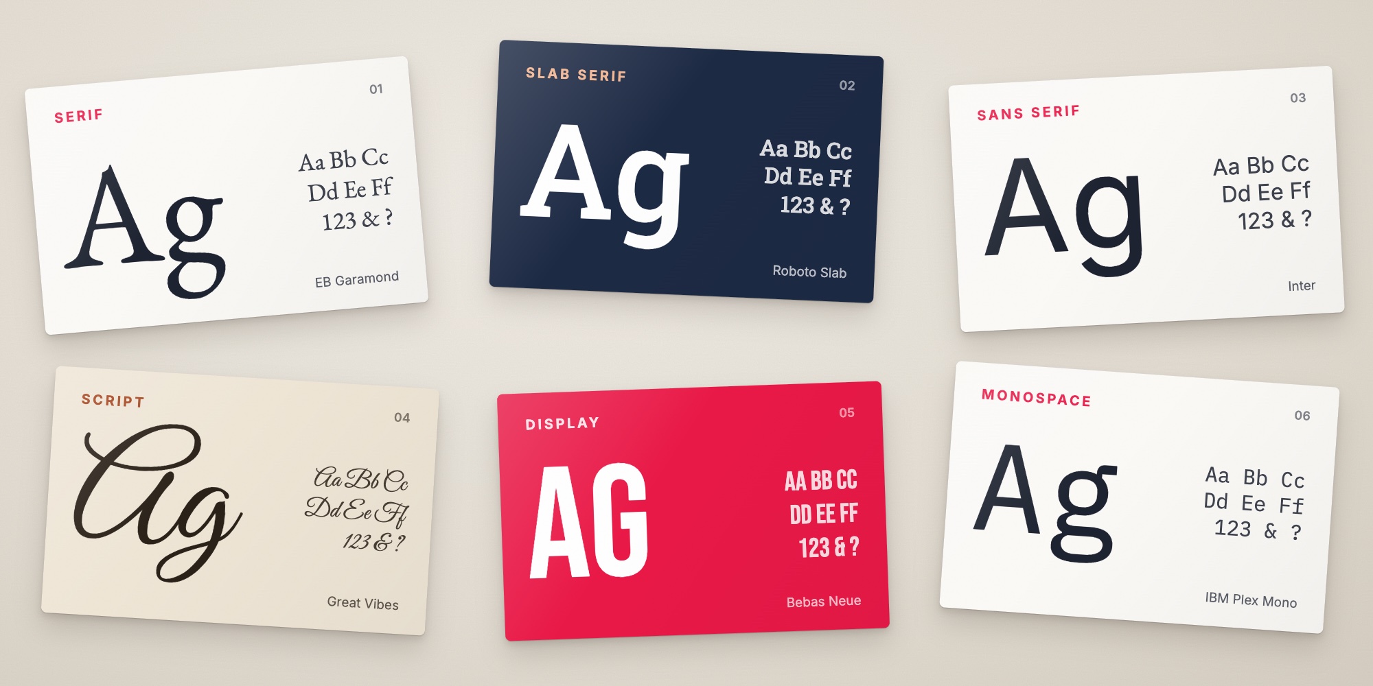
The 6 main types of fonts, serif, slab serif, sans serif, script, display and monospace, with examples, the styles within each, font vs typeface, and which types work on a business card.
 By Brandly Team
Inspiration
On this page
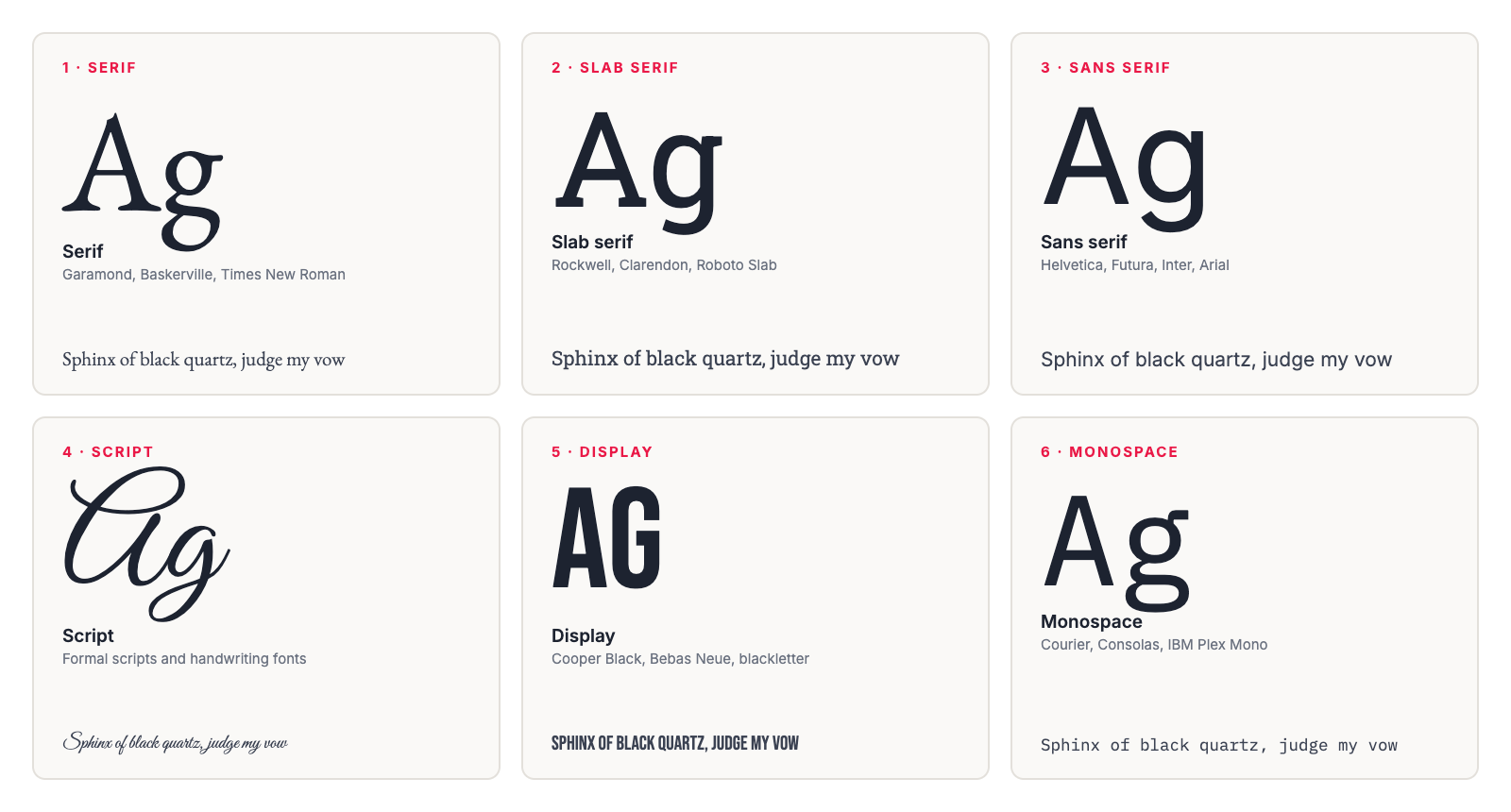
There are six main types of fonts: serif (Garamond, Times New Roman), slab serif (Rockwell), sans serif (Helvetica, Arial), script (formal and handwritten styles), display (decorative headline fonts) and monospace (Courier). Serif and sans serif fonts are the workhorses for body text and contact details. Script and display fonts are for a few words at a large size. On a business card, set the details in a serif or sans serif at 8 pt or larger, and save script and display fonts for a name or logo.
Every font belongs to a family of styles with its own history and personality. Knowing the main types makes it easier to choose fonts for your brand, pair them, and brief a designer. It also tells you which fonts will hold up on a business card, and which will turn into a blur at 8 pt.
Every sample in this guide is set in a free Google Font, so you can try any of them yourself.
The 6 types at a glance
| Type | What it looks like | Examples | Best for | On a business card |
|---|---|---|---|---|
| Serif | Small strokes at the ends of letters | Garamond, Baskerville, Times New Roman | Books, long reading, traditional brands | Names and details |
| Slab serif | Thick, square serifs | Rockwell, Clarendon, Courier | Headlines, bold and sturdy brands | Names and company names |
| Sans serif | No serifs, clean strokes | Helvetica, Futura, Arial, Inter | Screens, signs, modern brands | Everything, including small details |
| Script | Joined, flowing letters | Formal scripts, handwriting fonts | Invitations, a signature, a few words | A name only, never contact details |
| Display | Decorative, made for big sizes | Cooper Black, Bebas Neue, blackletter | Logos, headlines, posters | A company name or tagline |
| Monospace | Every letter the same width | Courier, Consolas, IBM Plex Mono | Code, forms, tech brands | Sparingly, for a technical feel |
1. Serif
Serif fonts have small strokes, called serifs, at the ends of their letters. They’re the oldest of the main types, based on letters carved in stone and written with broad pens. Most books and newspapers are still set in serif fonts.
Examples: Garamond, Baskerville, Times New Roman, Georgia. Free alternatives: EB Garamond, Libre Baskerville, Lora.
Personality: traditional, trustworthy, literary, established.
Serif fonts come in several styles, from soft and angled old style fonts to the sharp, high-contrast Didone fonts used on many fashion magazine mastheads. See serif and sans serif styles.
On a business card: a serif works well for names, and for contact details if it’s sturdy. Avoid serifs with very thin strokes for small text. They can break up at 7 to 8 pt and disappear in foil.
2. Slab serif
Slab serifs have thick, block-like serifs, often as heavy as the letters themselves. They first became popular in the 1800s on posters and advertising, where they had to be read from a distance. Clarendon dates from 1845, and Rockwell from the 1930s.
Examples: Rockwell, Clarendon, Courier. Free alternatives: Roboto Slab, Arvo, Zilla Slab.
Personality: sturdy, confident, friendly, a little industrial. Slab serifs are popular with construction, outdoor and food brands.
On a business card: good for a name or company name. In small sizes, slab serifs stay readable because their strokes don’t get thin, but they can look heavy for a full block of details.
3. Sans serif
Sans serif fonts have no serifs. “Sans” is French for “without.” They became common in the 1900s, and today they’re the default on screens, signs and most modern brands. Helvetica, released in 1957, is among the most widely used typefaces in the world.
Examples: Helvetica, Futura, Gill Sans, Arial, Verdana. Free alternatives: Inter, Jost, Source Sans 3, Lato, Montserrat.
Personality: modern, clean, neutral, efficient. Geometric sans serifs feel stylish. Humanist sans serifs feel warmer and friendlier.
On a business card: the safest choice for contact details, because simple letter shapes stay clear at 7 to 8 pt. Use one sans serif in two or three weights, such as bold for the name and regular for the details.
4. Script
Script fonts imitate handwriting, with letters that join or flow into each other. Formal scripts are based on elegant, pen-written lettering from the 1600s and 1700s. Casual and handwriting fonts look like brush or marker lettering.
Examples: Edwardian Script, Brush Script. Free alternatives: Great Vibes, Pinyon Script (formal), Pacifico, Caveat (casual).
Personality: elegant, personal, creative, romantic, or relaxed for casual styles. Script fonts suit weddings, beauty, bakeries and boutique brands.
On a business card: use a script for one or two words only, such as your name. Never use it for phone numbers, email addresses or web addresses, and never set a script in all capitals.
5. Display
Display fonts, also called decorative fonts, are designed to be used big. The category covers anything made for headlines and logos rather than reading: very bold or condensed fonts, outline fonts, stencils, retro styles and blackletter, the style used in the Gutenberg Bible.
Examples: Cooper Black, Impact, blackletter fonts. Free alternatives: Bebas Neue, Abril Fatface, UnifrakturMaguntia.
Personality: whatever the font is built to say. A display font is chosen for its character, from retro to playful to industrial.
On a business card: good for a company name, logo or short tagline at a large size. Pair it with a plain sans serif or serif for everything else. See clever business taglines for ideas.
6. Monospace
In a monospace font, every character takes up the same width, so an “i” gets as much space as an “m.” Monospace fonts come from typewriters. Courier was designed for IBM typewriters in the 1950s. Today, they’re mostly used for computer code.
Examples: Courier, Consolas. Free alternatives: IBM Plex Mono, JetBrains Mono, Roboto Mono.
Personality: technical, precise, a little retro. Monospace fonts suit software, engineering and brands that want a typewritten look.
On a business card: monospace fonts take up more room than other fonts at the same size. Use one as an accent, for example for a title or a web address, rather than for every line.
Serif and sans serif styles
Serifs and sans serifs are big groups. Typographers sort each one into styles, roughly in the order they appeared.
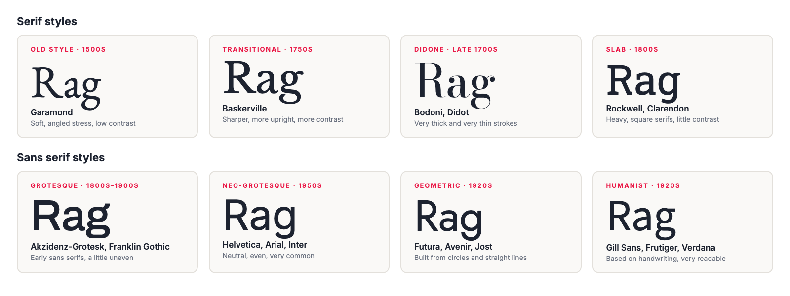
| Style | Era | Look | Examples |
|---|---|---|---|
| Old style serif | 1500s | Soft, angled, little contrast between thick and thin strokes | Garamond |
| Transitional serif | 1750s | Sharper, more upright, more contrast | Baskerville, Times New Roman |
| Didone serif | Late 1700s | Very thick and very thin strokes, hairline serifs | Bodoni, Didot |
| Slab serif | 1800s | Heavy, square serifs, little contrast | Clarendon, Rockwell |
| Grotesque sans | 1800s to early 1900s | Early sans serifs, a little uneven | Akzidenz-Grotesk, Franklin Gothic |
| Neo-grotesque sans | 1950s | Neutral and even | Helvetica, Arial |
| Geometric sans | 1920s | Built from circles and straight lines | Futura, Avenir |
| Humanist sans | 1920s | Based on handwriting, open and readable | Gill Sans, Frutiger, Verdana |
Serif vs. sans serif
Serifs feel traditional and established. Sans serifs feel modern and clean. The old rule was serif for print and sans serif for screens, but studies of reading speed haven’t found a clear winner, and high-resolution screens handle serifs well. Choose based on the personality you want, and on how the font holds up at the sizes you’ll actually use.
For the full comparison, see serif vs. sans serif. For business cards, see serif or sans serif on a business card.
Font vs. typeface
A typeface is the design: Inter, Garamond or Helvetica. A font is one specific version of it: Inter Bold, or Garamond Italic. All the fonts in one typeface make up a font family.
The difference comes from metal type. A printer bought a “font” of type, a full set of letters in one size and one style. One way to remember it: the typeface is the song, and each font is one recording of it.
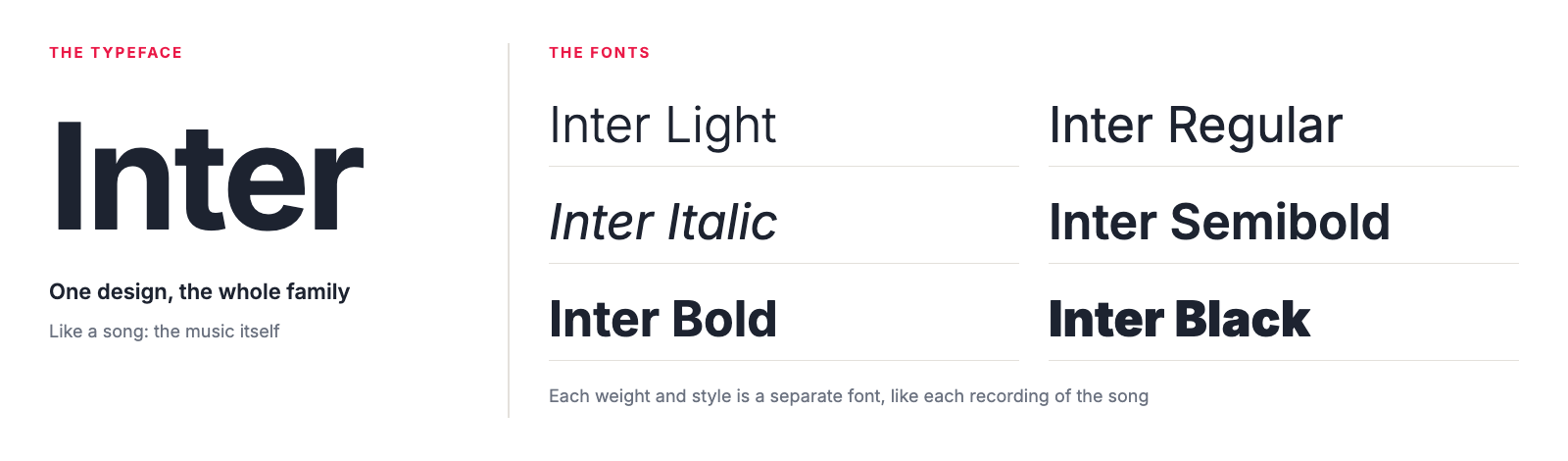
In everyday use, “font” means either one, and that’s fine. It matters when you buy a license, or when a printer asks for your fonts. You may need to send every weight and style you used, not just the family name.
Parts of a letter
A few terms make fonts much easier to compare and talk about.
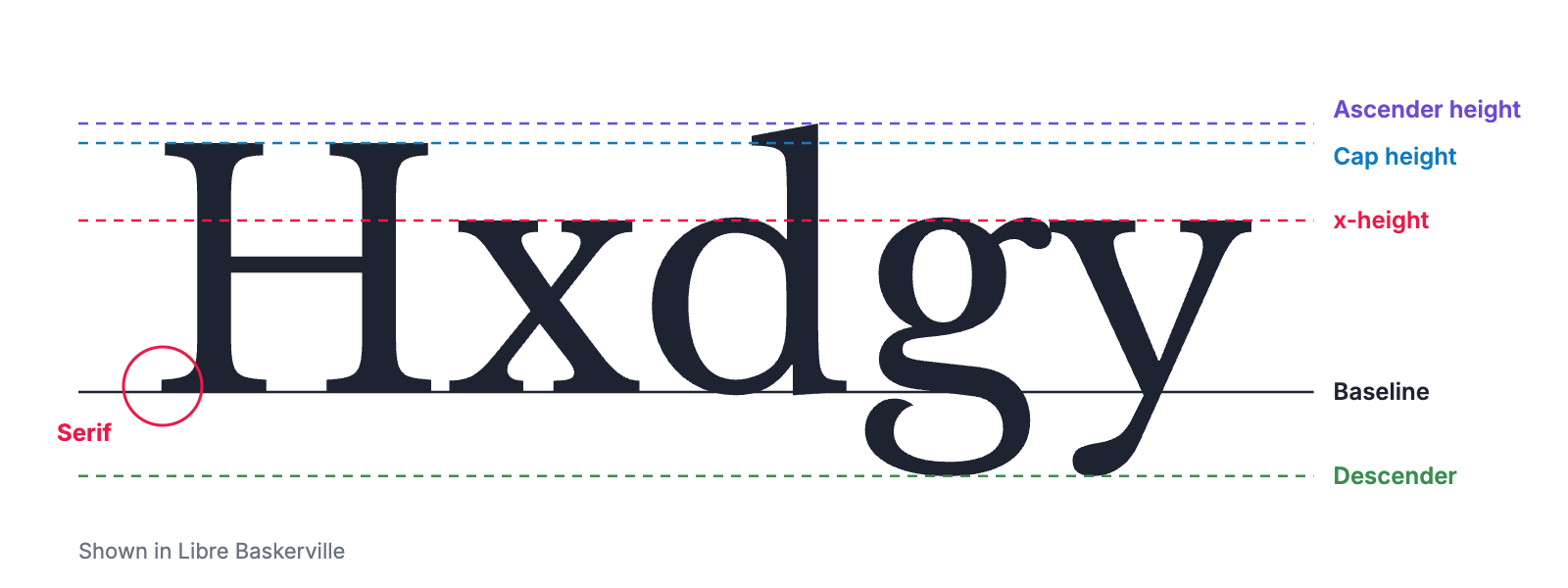
- Baseline: the line the letters sit on.
- x-height: the height of lowercase letters like “x.” Fonts with a large x-height look bigger and read better at small sizes.
- Cap height: the height of capital letters.
- Ascenders and descenders: the parts that rise above the x-height, as in “d,” or drop below the baseline, as in “g.”
- Serif: the small stroke at the end of a letter.
- Contrast: the difference between thick and thin strokes. High-contrast fonts look elegant but lose their thin strokes at small sizes.
- Weight: how thick the strokes are, from thin and light to bold and black.
Kerning, tracking and leading
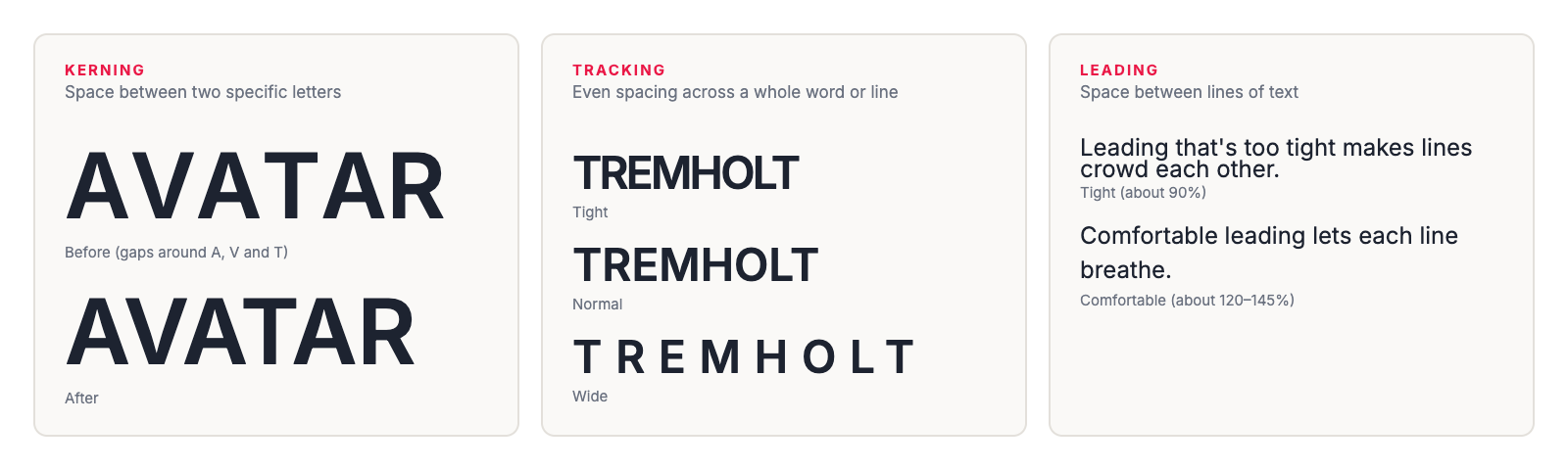
- Kerning adjusts the space between two specific letters, such as “A” and “V,” so the gaps look even. Good fonts come with kerning built in, but big text in logos and headlines often needs a manual touch.
- Tracking, or letter spacing, adds or removes space evenly across a whole word or line. Wide tracking in small capitals looks polished on a job title. Tight tracking makes small text hard to read.
- Leading, pronounced “ledding,” is the space between lines. The name comes from the strips of lead printers placed between lines of metal type. About 120 to 145% of the font size is comfortable for most text.
How to choose a type of font
- Start with your brand. If you have brand fonts, use them everywhere, including business cards, letterhead and email signatures.
- Match the personality. Serif for traditional, sans serif for modern, slab serif for sturdy, script for elegant or personal, display for bold character.
- Pick a workhorse. You need at least one serif or sans serif that’s readable at small sizes, with regular and bold weights. See professional fonts for business for free options.
- Use one or two typefaces. One for headlines or names and one for everything else is plenty. See how to pair fonts.
- Test at real size. Print a sample. Check the smallest text, usually the contact details at about 8 pt.
- Check the license. Make sure it covers print and, if needed, your website and apps.
Fonts on business cards
A business card is one of the hardest tests for a font: a lot of information, small sizes, and sometimes foil or a dark background.
- Set contact details in a serif or sans serif at about 8 pt, and never below 7 pt. See business card font sizes.
- Use script and display fonts for a few words only, such as a name or company name, at a larger size.
- Avoid hairline strokes for small text, especially with foil or white text on a dark background.
- Embed your fonts when you send a PDF, so the text prints exactly as you designed it.
- Keep everyone on the same fonts. When every employee orders cards from the same template, the fonts, sizes and layout stay consistent.
With Brandly, you upload your card design once as a PDF with the fonts embedded, and it becomes a template. Your brand fonts are locked in, and each employee fills in only their own details. See how to prepare a business card PDF.
A note on font licenses
Fonts are software, and each one comes with a license. Fonts that come with your computer, or that you buy for desktop use, usually cover printed items like business cards, but website and app use often needs a separate license. Google Fonts are free for commercial use, including print. If a designer chose your fonts, ask them which licenses you have.
- Know the type of each font you use.
- Pick one workhorse serif or sans serif with regular and bold weights.
- Limit yourself to one or two typefaces.
- Save script and display fonts for a name, logo or headline.
- Set small text at 8 pt or larger, and print a test.
- Check your font licenses cover print.
- Embed fonts in the PDF you send your printer.
Types of fonts FAQs
What are the main types of fonts?
The six main types are serif (Garamond, Times New Roman), slab serif (Rockwell), sans serif (Helvetica, Arial), script (formal and handwritten styles), display (decorative fonts for headlines) and monospace (Courier). Some lists merge slab serif into serif, which gives you five.
What's the difference between a font and a typeface?
A typeface is the design, like Inter or Garamond. A font is one specific version of it, like Inter Bold or Garamond Italic. Most people use the words interchangeably, and that’s fine in everyday use.
What is the difference between serif and sans serif?
Serifs are the small strokes at the ends of letters. Serif fonts have them and feel traditional. Sans serif fonts don’t, and feel modern and clean. “Sans” is French for “without.”
What is the most readable type of font?
For body text, a plain serif or sans serif with open letters and a generous x-height. Research hasn’t found a clear winner between the two. Script, display and very thin fonts are the hardest to read, especially at small sizes.
Which type of font looks most professional?
Clean serifs and sans serifs. Sans serifs like Helvetica, Inter or Source Sans look modern and neutral. Serifs like Garamond or Baskerville look established, which suits law, finance and hospitality.
Which fonts can I use on a business card?
Use a serif or sans serif for the contact details, at about 8 pt or larger. Script and display fonts work for a name or company name, but not for phone numbers and email addresses. Check that your font license covers print, or use a free Google Font.
The takeaway
The six main types of fonts are serif, slab serif, sans serif, script, display and monospace. Serifs and sans serifs do most of the work. Script and display fonts add personality in small doses. Monospace is a specialist. Choose a readable workhorse, add one accent if you need it, and test everything at the size it will actually print. For more on choosing a logo, see types of logos.
Set Up Your Free Business Card Portal
Get Started