Types of Logos: The 7 Main Logo Types, With Examples
The 7 types of logos, wordmark, lettermark, pictorial mark, abstract mark, mascot, emblem and combination mark, with famous examples, pros and cons, and how each one holds up on a business card.
 By Brandly Team
Inspiration
On this page
There are seven main types of logos: wordmarks (Coca-Cola), lettermarks (IBM), pictorial marks (Apple), abstract marks (Nike), mascots (the Michelin Man), emblems (BMW) and combination marks (Microsoft). Most companies use a combination mark, a symbol plus the name, with separate versions for small spaces. On business cards, wordmarks, lettermarks and combination marks are the easiest to print. Emblems and mascots need a simplified small version.
Every logo falls into one of a handful of types. Knowing which one you have, or which one you need, tells you a lot: how hard it will be to build recognition, which versions you’ll need, and how the logo will look on a business card, a name badge or a foil-stamped folder.
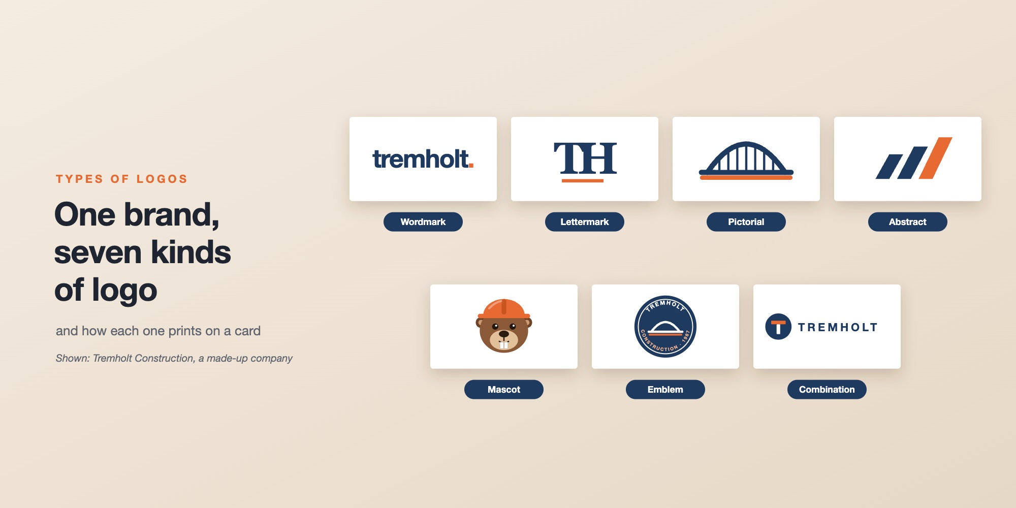
To show the difference, we drew one company seven ways. Tremholt Construction is made up. In our story, it’s a family-owned builder founded in Minneapolis in 1987, with about 140 people who build bridges, schools and civic buildings. That’s why a bridge shows up in its pictorial mark and its emblem, and why its mascot, Holt the beaver, wears a hard hat. Its logo has to work everywhere from a jobsite sign to a project manager’s business card.
Wordmark
The name, set in distinctive type.
Lettermark
Initials only, for long names.
Pictorial mark
A recognizable picture: a bridge, because Tremholt builds them.
Abstract mark
Three rising beams that mean nothing until a company makes them its own.
Mascot
A character: Holt the beaver, in a hard hat.
Emblem
Name and symbol inside a badge.
Combination mark
Symbol and name together. The most common choice.
The 7 types at a glance
| Type | What it is | Famous example | Works small? | On a business card |
|---|---|---|---|---|
| Wordmark | The name in distinctive type | Coca-Cola, Google | Yes, if the name is short | Easy. Prints well in foil |
| Lettermark | Initials only | IBM, Volkswagen | Yes | Easy. Great for foil and embossing |
| Pictorial mark | A recognizable picture | Apple, Target | Yes, if the drawing is simple | Easy, but add the name |
| Abstract mark | A unique shape | Nike, Mastercard | Yes | Easy, but add the name |
| Mascot | A character | Michelin Man, KFC’s Colonel | Rarely | Needs a simplified version |
| Emblem | Name inside a badge | BMW, UPS | Hard, if it has small text | Test the small text |
| Combination mark | Symbol plus name | Microsoft, Toyota | Yes, using the symbol alone | The most flexible |
1. Wordmark
A wordmark, or logotype, is the company name set in a distinctive typeface or custom lettering, with no separate symbol.
Choose it when your name is short, distinctive and is the thing you want people to remember. It’s the most practical choice for a new company, because people learn the name and the logo at the same time.
Watch out for long names, which get small and hard to read when they have to fit a badge or a social profile. A wordmark also depends heavily on its typeface. See fonts for business cards.
On a business card: wordmarks are easy to print, and a bold one looks great in gold or silver foil. Keep the letters large enough that thin strokes don’t disappear.
2. Lettermark
A lettermark, or monogram, uses the company’s initials. IBM is short for International Business Machines, and Volkswagen’s VW stands in for a long name.
Choose it when your full name is long or hard to say, and people already know you by your initials.
Watch out for initials that mean nothing to people who don’t know you yet. Most companies with lettermarks became well known first, or put the full name nearby.
On a business card: lettermarks are compact and work well in foil, embossing and spot gloss. Put the full company name elsewhere on the card.
3. Pictorial mark
A pictorial mark, or logo symbol, is a picture of a real thing: an apple, a bullseye, a bird. The picture may or may not relate to what the company does.
Choose it when you have a simple image that’s easy to connect to your name, like Target’s bullseye.
Watch out for pictures that are too detailed to shrink, or too generic to own. A house shape for a real estate company or a tooth for a dentist is hard to tell apart from competitors.
On a business card: simple pictures print well at any size, but most companies still need the name next to the picture. Apple and Target are exceptions that took decades of advertising.
4. Abstract mark
An abstract mark is a shape that doesn’t picture anything real. It means something only because a company uses it consistently.

Choose it when you want a symbol nobody else has, that works in any language and won’t date as your business changes.
Watch out for the time it takes. An abstract shape means nothing at first, so it has to be paired with your name for years before it can stand alone. See the Nike story.
On a business card: abstract marks are usually simple, solid shapes, so they print well small, in one color and in foil. Keep the name next to them.
5. Mascot
A mascot logo is a character, like the Michelin Man, KFC’s Colonel Sanders or the GEICO gecko. Mascots give a brand a personality and work well in advertising.
Choose it when your brand is friendly and consumer-facing, and you’ll use the character in ads, packaging and social media.
Watch out for detail. Characters are full of small features that blur at small sizes, and they can feel out of place for a law firm or a bank. Most mascot brands also have a simpler wordmark for everyday use.
On a business card: use a simplified version of the character, or the wordmark, on the front. A large, full-color mascot can go on the back.
6. Emblem
An emblem puts the name and a symbol inside a shape, like a circle, a shield or a crest. Car makers, universities, sports teams and government agencies often use them.
Choose it when you want a traditional, established feel, or the badge shape itself suits your industry.
Watch out for small text inside the badge, which is the first thing to blur when the emblem is printed small. Emblems also can’t be split up: the name can’t come out of the shield.
On a business card: test the emblem at about half an inch. If the text inside it blurs, make a simplified version for small uses, or put the name next to the emblem in larger type. See the small-size test.
7. Combination mark
A combination mark pairs a symbol with the company name. It’s the most common type, because it gives people a name to remember and a symbol for small spaces.

Choose it when you want flexibility. You can use the symbol and the name together, or separate them: the name alone on a long banner, the symbol alone as an app icon.
Watch out for inconsistency. Without clear rules, different offices end up stacking, spacing and coloring the two parts differently.
On a business card: the horizontal version usually sits on the front, and the symbol alone works well on the back. Lock one version into your card template, so every card matches.
Every logo needs a few versions
Whatever type you choose, one file isn’t enough. A business card, a name badge and an app icon all need different shapes. Most companies have at least three versions of their logo:
Horizontal
For the top of letterhead, email signatures and most business cards.
Stacked
For square spaces: the back of a card, badges and social profiles.
Icon only
For tiny spaces: app icons, favicons, the corner of a badge.
Each of those also needs a one-color version and a reversed version (white on your brand color), for dark cards, foil and embroidery. See the one-color test.
How to choose a logo type
- Is your name short and distinctive? A wordmark or a combination mark.
- Is your name long, or known by its initials? A lettermark, with the full name nearby.
- Do you need a symbol for app icons, badges and social profiles? A combination mark, so the symbol can stand alone.
- Is your brand playful and consumer-facing? A mascot can work, with a wordmark for everyday use.
- Do you want a traditional, established feel? An emblem, with a simplified small version.
- Where will the logo appear most? If it’s mostly on business cards, badges and letterhead, choose a type that works small and in one color.
Logos on business cards
Whatever the type, the same rules apply when your logo goes on a business card:
- Use vector artwork, such as AI, EPS, SVG or a PDF from a design app.
- Set colors in CMYK, or match your brand’s Pantone colors.
- Choose the right version: horizontal for the front, stacked or the symbol alone for the back.
- Keep it inside the safe area, with clear space around it. See business card size and safe area.
- Use simple, solid shapes for foil or spot gloss. See business card paper types.
With Brandly, you upload your card design once as a PDF, and it becomes a locked template. The logo, colors and layout stay fixed, and each employee fills in only their own details. See how to prepare a business card PDF.
- Know your logo type, and what it needs to work small.
- Get the main versions: horizontal, stacked and icon only.
- Get one-color and reversed versions of each.
- Test the smallest version at about a quarter inch.
- Use vector files, with colors in CMYK or Pantone.
- Lock one approved version into your business card template.
Logos shown are trademarks of their respective owners and are included for commentary. Brandly isn’t affiliated with or endorsed by these companies.
Types of logos FAQs
What are the 7 types of logos?
Wordmarks (the name in distinctive type), lettermarks (initials), pictorial marks (a recognizable picture), abstract marks (a unique shape), mascots (a character), emblems (name and symbol inside a badge) and combination marks (a symbol and the name together).
What is the most common type of logo?
The combination mark. Pairing a symbol with the company name gives people the name to remember and a symbol for small spaces, and the two can be used together or apart.
What's the difference between a wordmark and a lettermark?
A wordmark spells out the full name, like Coca-Cola or Google. A lettermark uses only initials, like IBM or the Volkswagen VW, which suits companies with long names.
What is a combination mark?
A logo that combines a symbol with the company name, like Microsoft’s four squares next to its name. Most companies use one, with versions that can split the symbol from the name.
Which type of logo works best on a business card?
Wordmarks, lettermarks and combination marks are the easiest, because they’re readable at small sizes and work in one color and in foil. Emblems and mascots work too, but usually need a simplified version for small spaces.
Can a business use more than one logo type?
Yes, and most do. A typical logo system includes a horizontal combination mark, a stacked version, an icon on its own, and one-color and reversed versions of each.
The takeaway
There are seven main types of logos: wordmarks, lettermarks, pictorial marks, abstract marks, mascots, emblems and combination marks. Most companies end up with a combination mark, because it’s the most flexible. Whatever your type, make sure you have the versions you need, and that each one still works small, in one color and on a business card. For the stories behind the world’s best-known logos, see famous logos and what they teach.
Set Up Your Free Business Card Portal
Get Started